Cost Projection
by PwC
The challenge
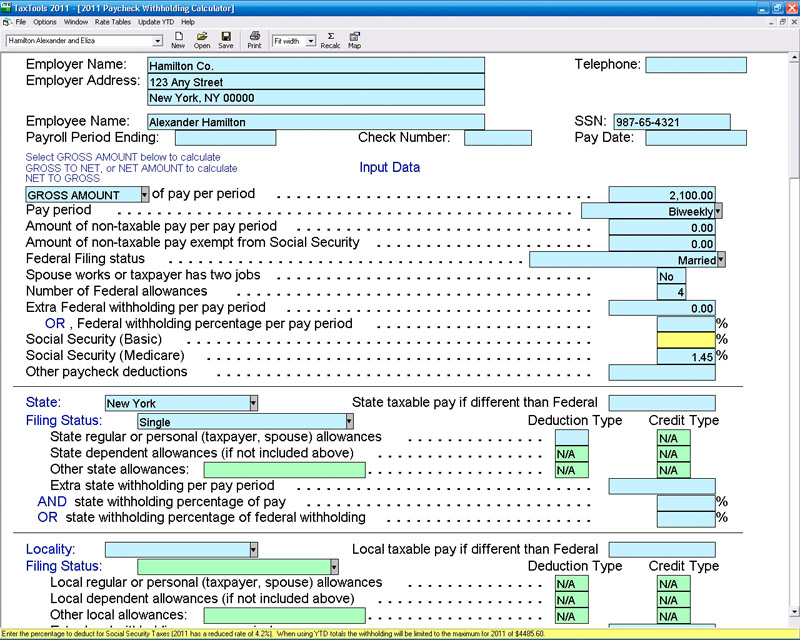
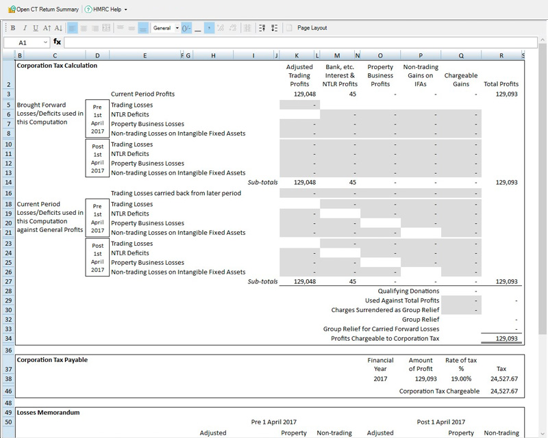
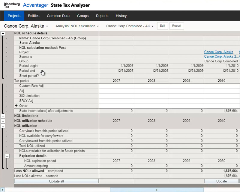
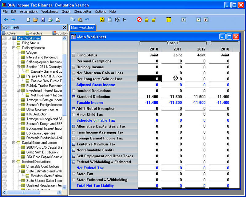
In the world of corporate tax calculators, user experience is not a high priority. Instead, engineers try to pack as much information and functionality above the fold as possible, and divide the remaining parts among an endless series of tabs, icons, and overlays. When design is applied, it's often unbalanced or heavy-handed, which creates pockets of distraction, rather than implicit information.
This reality exists because the people who decide which tax software to buy for their organization are not the people who will end up using it for 8+ hours a day, so the decision often come down to price, not quality. Ultimately, the end users are forced to spend weeks training on these difficult tools in order to compensate for the lack of UX research involved in developing the product.
The opportunity
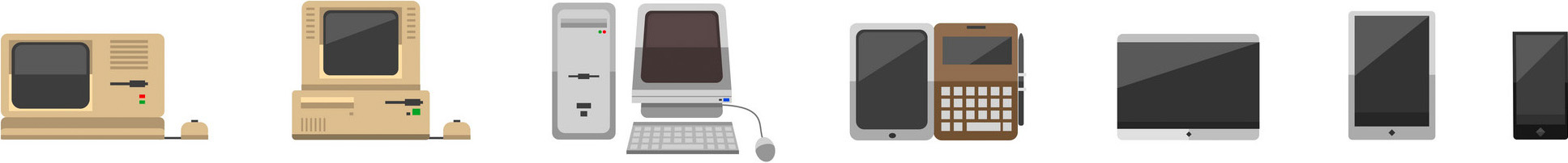
I've chosen to break from the antiquated design patterns of previous industry leaders, which are essentially different remixes of Microsoft Excel. I can instead build a product that takes advantage of advancements in modern work machines, and tailor it to the needs of the today's end user.
Research
Competitive analysis
It's easy for me to look at examples of corporate tax software and dismiss them as a collection of UX mistakes. However, after analyzing them closely and discovering patterns that exist in most examples, several facts become clear:
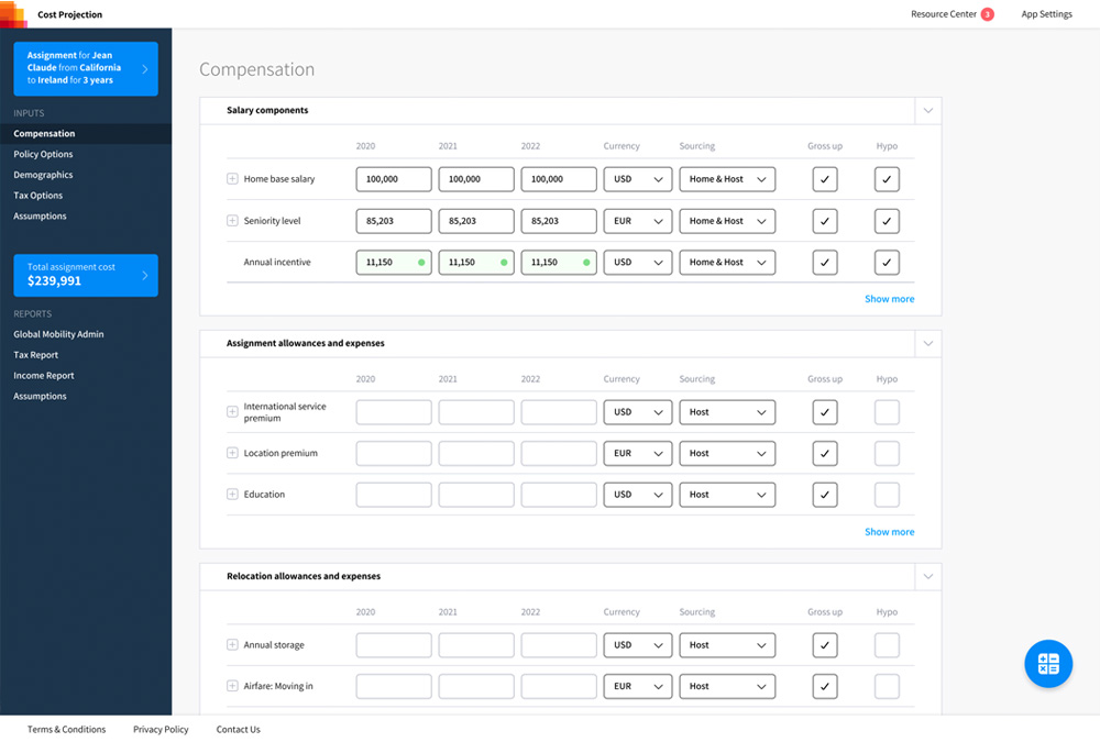
- Information proximity: Having data points close together is important, because users need to reference multiple segments of existing data as they're creating new data.
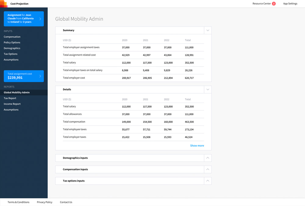
- Data tables: These are the most effective way to organize tax information, so this is the wheel that I should not reinvent.
- Data prioritization: Secondary information should be hidden in plain sight, in the form of collapsed rows or easily accessible panels.
- Wasted effort: Repetitive work is very common, so any way I can find to eliminate or minimize it would be a productivity boost.
- Minimalism: With a data-rich experience like this, aesthetic decisions need to be made in a very delicate manner, and in a way that scales to the entire experience. Having too many unique design elements can become tedious.
User interviews
My big advantage in designing and building this tool is that I share a building with many experienced accountants, ones who use similar tools every day. In researching this experience, I met with accountants who don't use the tools assigned to them, and instead are clever enough to develop their own macros to do their work faster. These macros served as a blueprint to help me understand how best to reorganize and optimize features and information on the screen.

As my continued to improve my prototype, I held dogfooding sessions with groups of volunteers. I gave them test assignments and asked them to use my tool to complete them. I encouraged them to work together and ask each other questions as they learned the tool on their own, to simulate a real-world environment, and to see which features worked well and which ones needed to be more intuitive.
I also met with partners within the firm who were responsible for managing the clients that would ultimately be the customers of this app. I wrote an analysis detailing the unique reporting requirements for each client, which led me to build a feature into the app that allowed for custom report templates based on a set of inputs provided via JSON file. This improved upon the old method, which was to have engineers build custom report screens for each client. This allowed users to create custom reports by simply generating a new template and adding the necessary inputs.
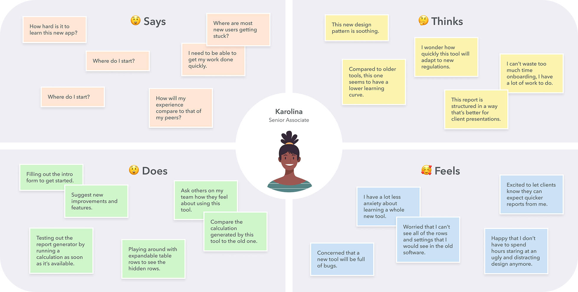
Empathy map
Powered with the knowledge I gained by interviewing and monitoring associates in the firm as they were dogfooding my prototype, I was able to group all associates into 4 personas:
- Karolina: Senior Associate
- Michelle: Director
- Amir: Subject Matter Specialist
- Javier: Client
I then took all of the notes for each persona, and separated them into categories to fit into an empathy map. This helped me not just to understand the needs of each stakeholder for my product, but to also empathize with their concerns. I used these empathy maps as guides whenever I was considering a new design pattern or feature, asking myself how this would affect each persona.
The design
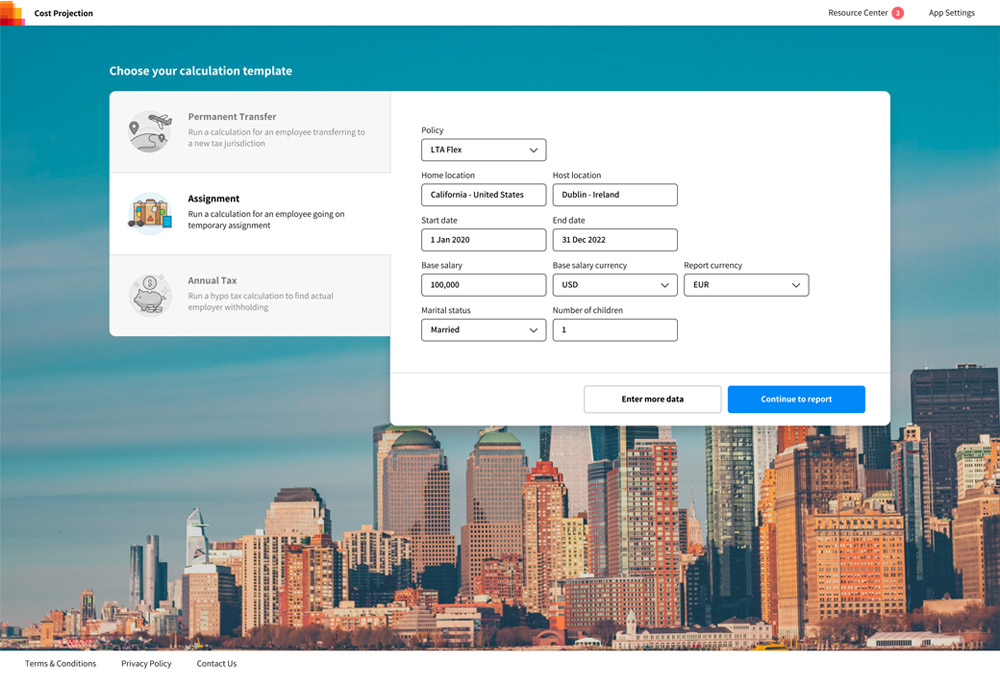
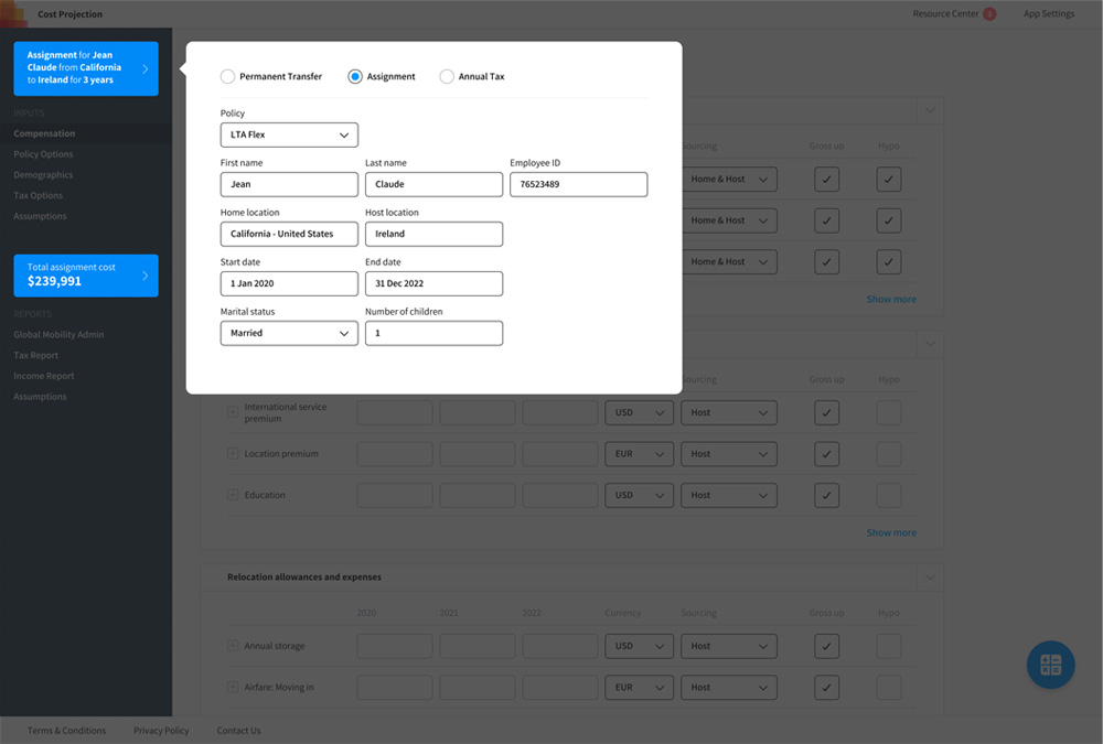
The end result of my research and refinement was a product that prioritized simplicity, efficiency, and elegance. The user starts with a short form asking for simple information, which then sets up the rest of the app, rather than starting them with the kitchen sink and having them work backwards. This has the added benefit of easing them into the process, thereby minimizing beginner's anxiety.
I implemented several features designed to eliminate repetitive work. Many times, a user must enter the same value for each cell in a row, so I built in an autofill setting. Also, previous generations of tax software required users to run a calculation and wait for it to complete before moving forward, often being hit with error messages after the calculation fails. In this software, a calculation is run every time new data is entered, so the user knows immediately if there's an error, and there is no need to wait for a calculation to run.
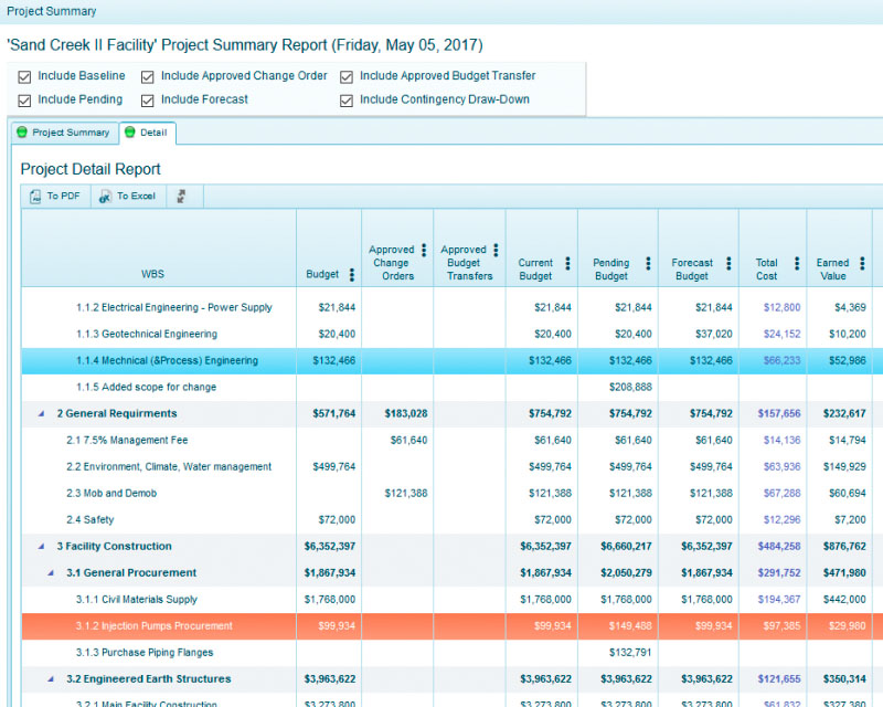
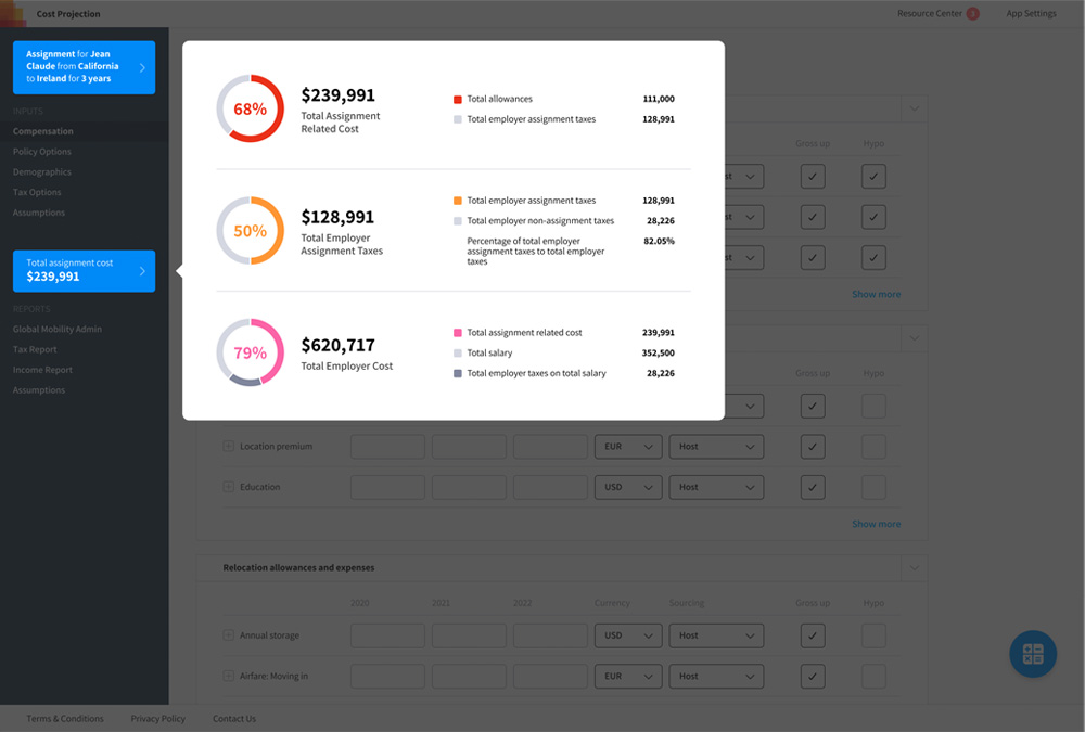
I designed a report summary widget to allow the user to quickly decide if their calculation is correct, without having to analyze the full report to make that determination. In the past, the user would have to dig through several pages of a report to figure out if the calculation is correct.
The custom report template feature was a game changer, because accountants used to be required to make additional calculations by hand for each client before sending off the final report. With custom templates, the software does this work for them.
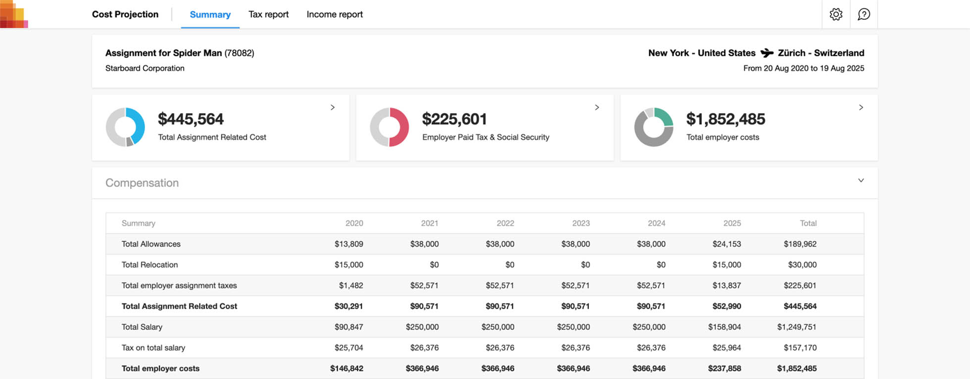
Here is a demo of the report shown above running a custom client template. The tiles at the top of the screen are dynamically generated values and descriptions which are calculated using inputs from the standard values below. This work used to be done by hand for each client, and is now handled via JSON.