Credit Builder
by EarnIn
The challenge
A credit score is not the most straightforward concept to understand. The range is arbitrary, there are multiple conflicting values, and there is a list of contributing factors with varying degrees of impact. For our users to become sufficiently educated on the process and their credit status, I need to do an excellent job of visualizing these data points, and laying them out in an experience that tells a single clear story.
One crucial fact to keep in mind is that almost all of our users face financial hardship, so there's no benefit to making them feel ashamed for having a low credit score. We should avoid negative connotations in the design, and instead focus on encouragement.
The opportunity
This is the first journey introduced to the Earnin experience that is not related to transferring or spending money, and is instead focused on financial education and self-improvement. This means we have an opportunity to show our community that we're making a serious commitment to improving their financial status. If we do this right, our customers will develop stronger financial health and habits by using our app.
This also gives us the opportunity to contribute new standards and features to our design system, making it more robust, and paving the way for future journeys to be built using those tools.
Research
Competitive analysis
As with the money transfer experience, there are some well-established patterns for displaying credit information that users have come to expect.
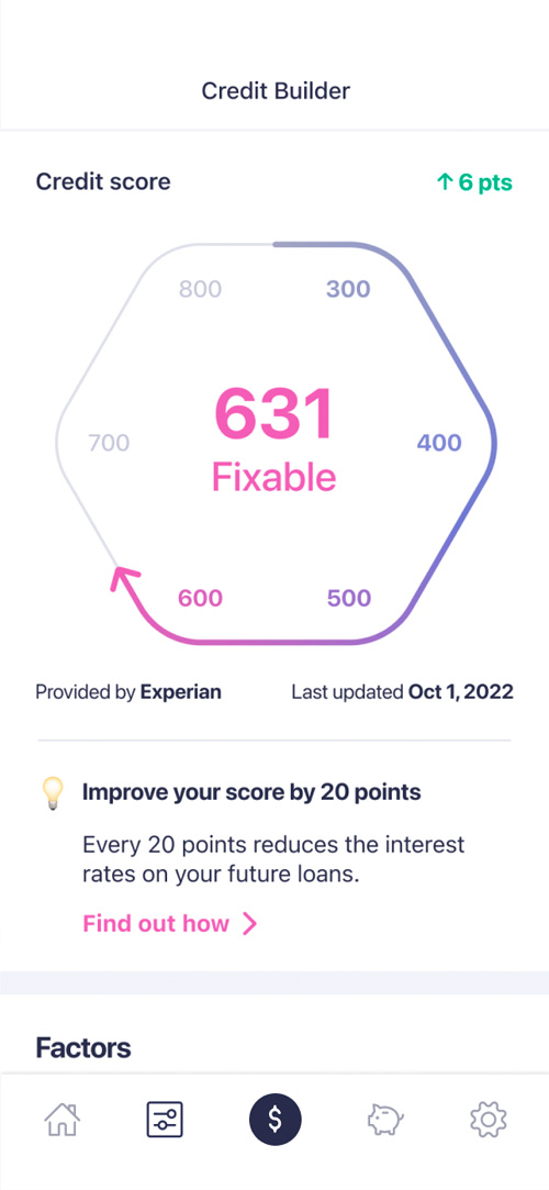
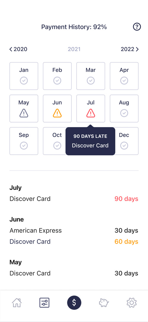
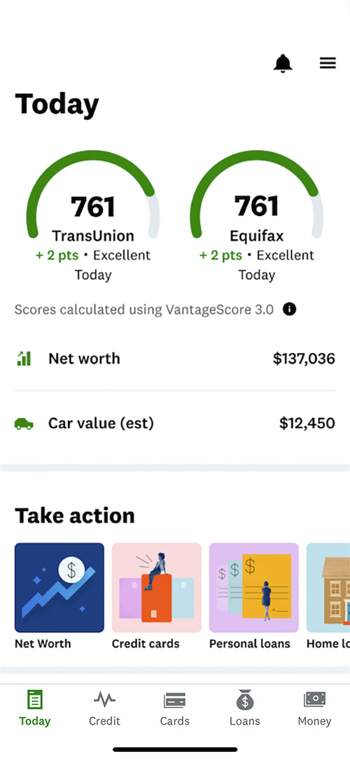
- Scores: The first element the user should see is always one or several scores. Each score will include the name of the agency, the latest change, and the date of the most recent update.
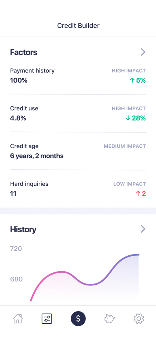
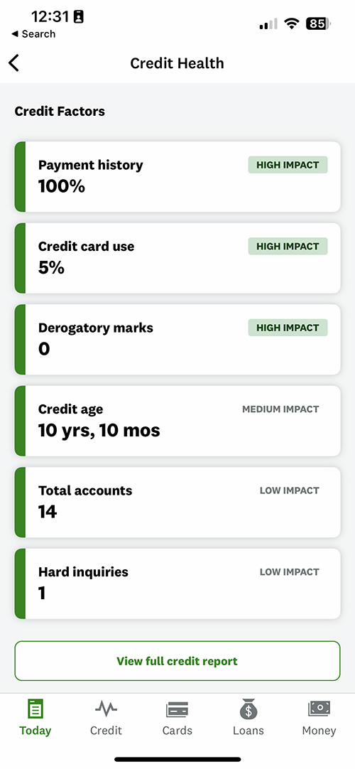
- Factors: To help educate the user, most credit monitoring apps include a list of credit factors, each with a description and impact level. This helps the user understand which sets of behaviors are most critical to maintaining a good score.
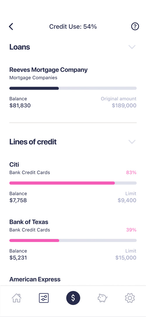
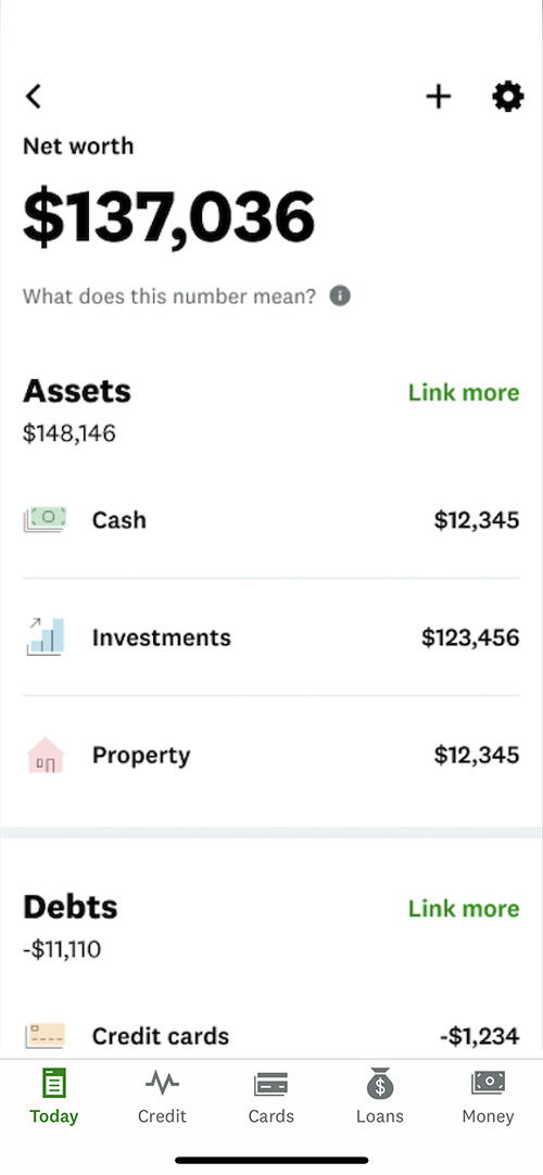
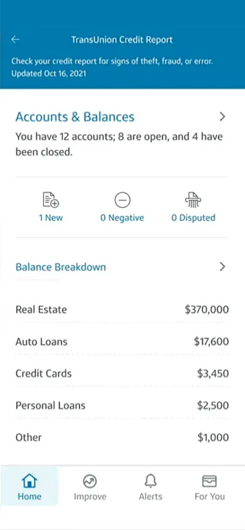
- Balances: Not always present, but showing where a user owes the most money could be relevant to helping them understand more about their debt.
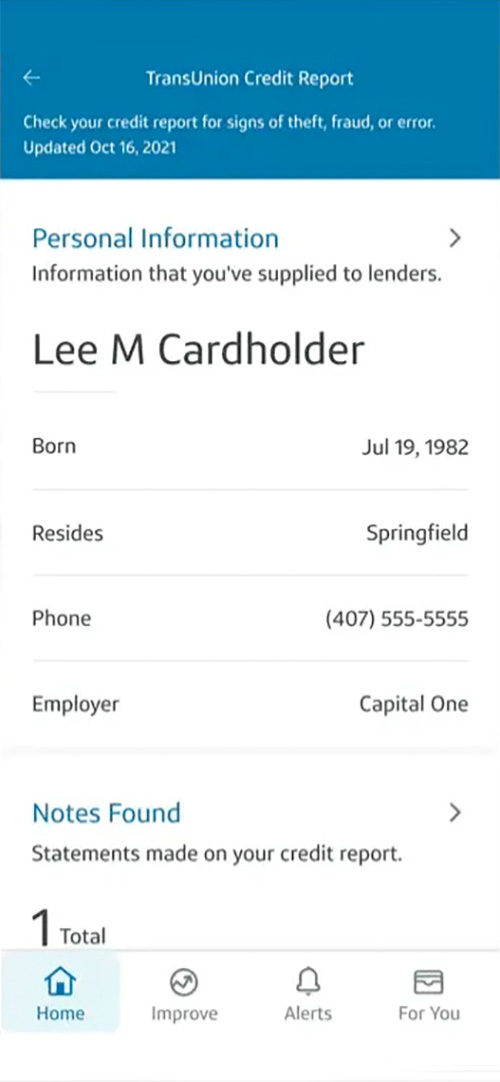
Credit Karma
As an industry standard this app has several powerful features that are worth considering for inspiration. One feature in particular that could be valuable to our users is the credit factors list, which shows factors in descending order of impact, and clearly describes the status of each factor.
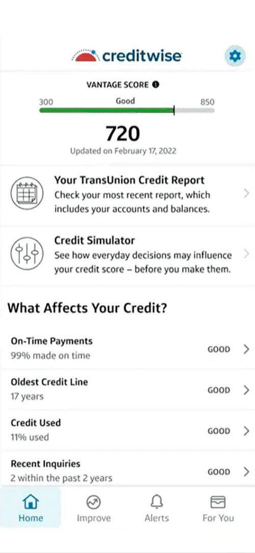
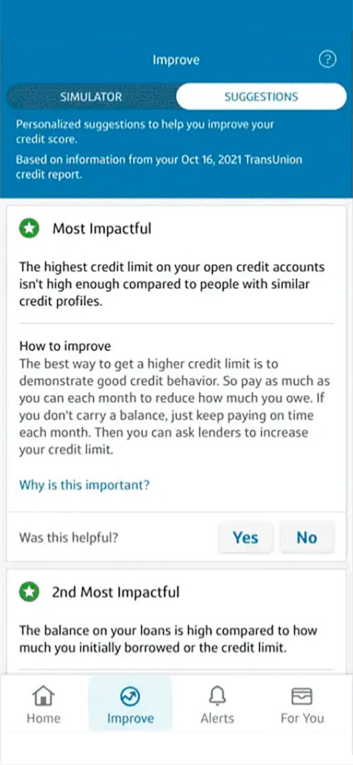
CreditWise
While there's some room for improvement in this UX, one aspect I really appreciate is the suggestions tab, which gives users tips on how to improve their credit score. Since Earnin's feature is geared toward credit building, not just credit monitoring, this would be a crucial addition.
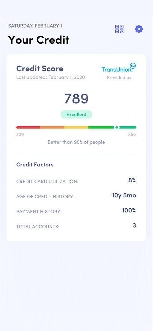
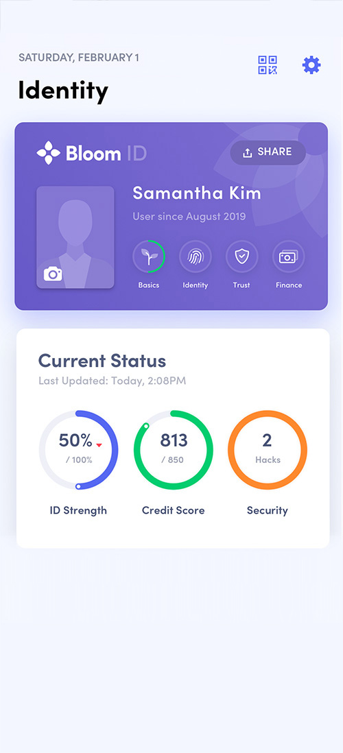
Bloom
Aesthetically, I would argue that this app is a winner. It uses bright, dynamic colors and imagery to communicate information. It has a balanced UI with great contrast. It also feels optimistic and encouraging, which puts the user at ease. One design cue I will definitely be borrowing is how well they separate information with their tiles.


The design
In this design, I've included some of the new design patterns I introduced in earlier designs, such as the clean white background, the pink-to-purple gradient, and the full-bleed tiles.
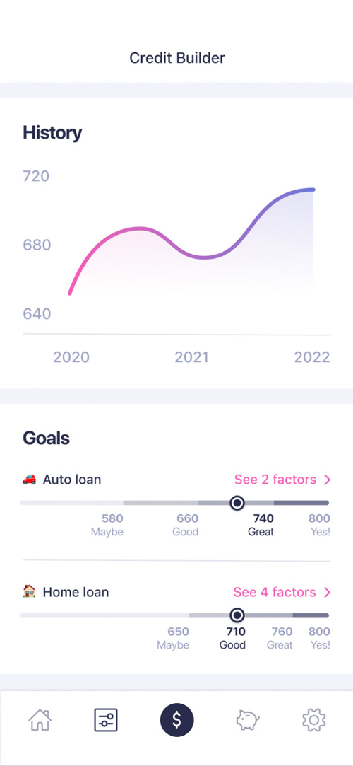
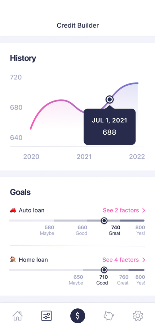
I've also chosen to avoid negative labels, and dedicated the space directly below the credit score to insights for customers, in the spirit of motivating users to work on their score. Finally, I've chosen to include a goals tile to inform users about the scores they will need for each personal goal.