Home Screen
by EarnIn
The challenge
As Earnin grows as a business and aims to attract a wider range of users, our design system and brand must adapt to more accurately represent us. Our existing design patterns hint at a small, fun company that does a few things well, but isn't necessarily ambitious in its pursuit of new innovative solutions.
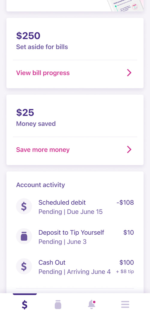
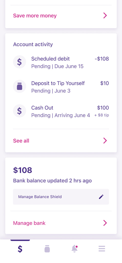
This is evident when looking at the home screen, which features repetitive tile structures dominated by brand colors and bland icons, and lacking the rich data and dynamic imagery of an exciting cutting-edge neobank. We should also do a better job of separating labels from numbers. Currently, aside from a few places, most of the numbers on the home screen are given the same or similar style treatment to their labels, which makes the numbers harder to spot.
Finally, I would like to add a personal touch to the home screen, to make the user feel like we are paying attention to them, and are always there when they need us.
The opportunity
While the current home screen serves as a snapshot of the user's financial state, I want to design a home screen that tells a story of the user's money. Not just what's happening today, but what happened in the past few days, and what's going to happen tomorrow.
I would like to summarize the user's status in a single message, in case they only have a moment to check the app. I would also like to introduce controls that allow the user to do things like lock their card and set their budget, directly from the home screen.
Finally, while I would like to maintain consistency in tile design, I aim to eliminate the repetitive nature that exists in the current design.
Research
Competitive analysis
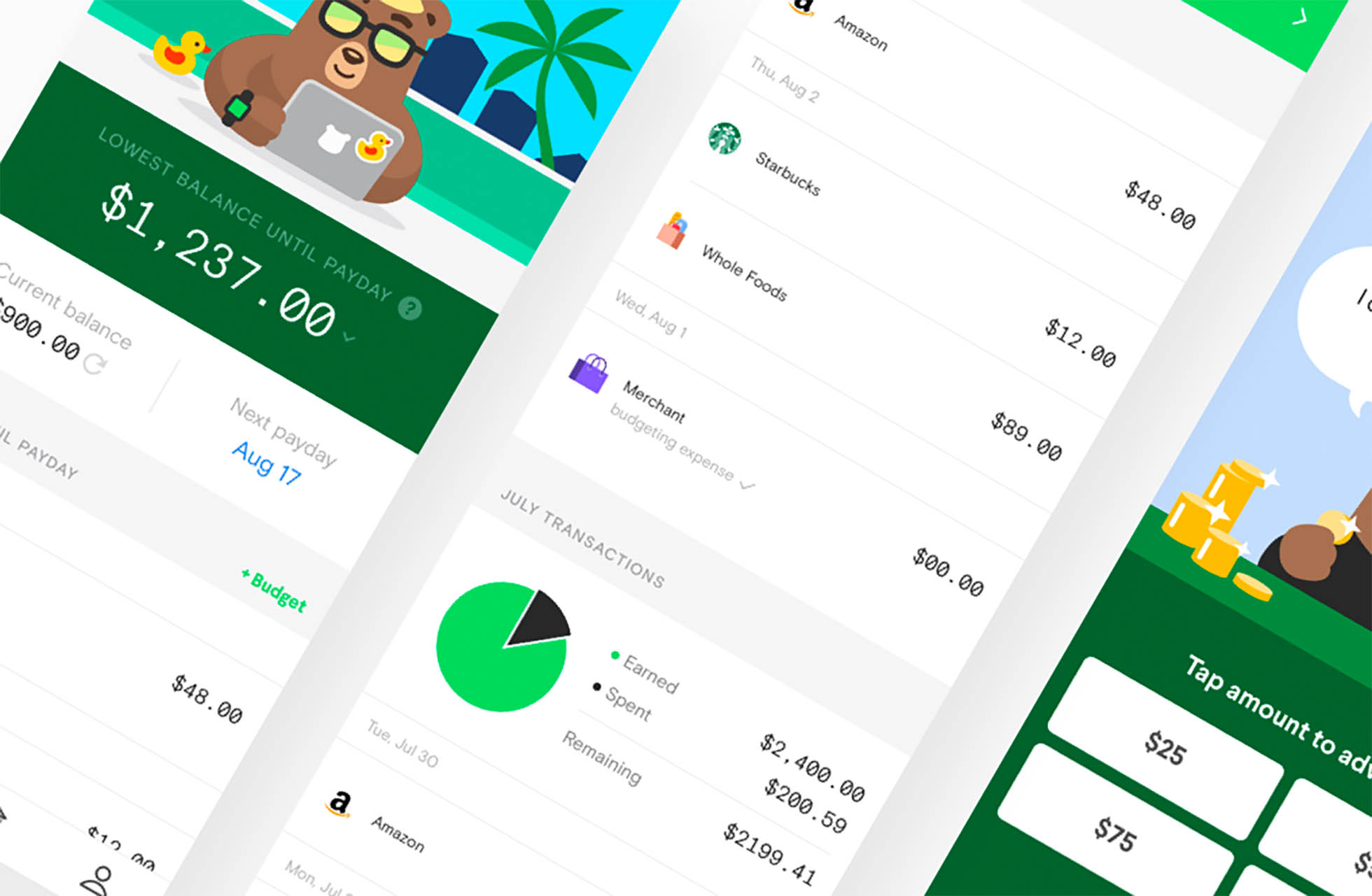
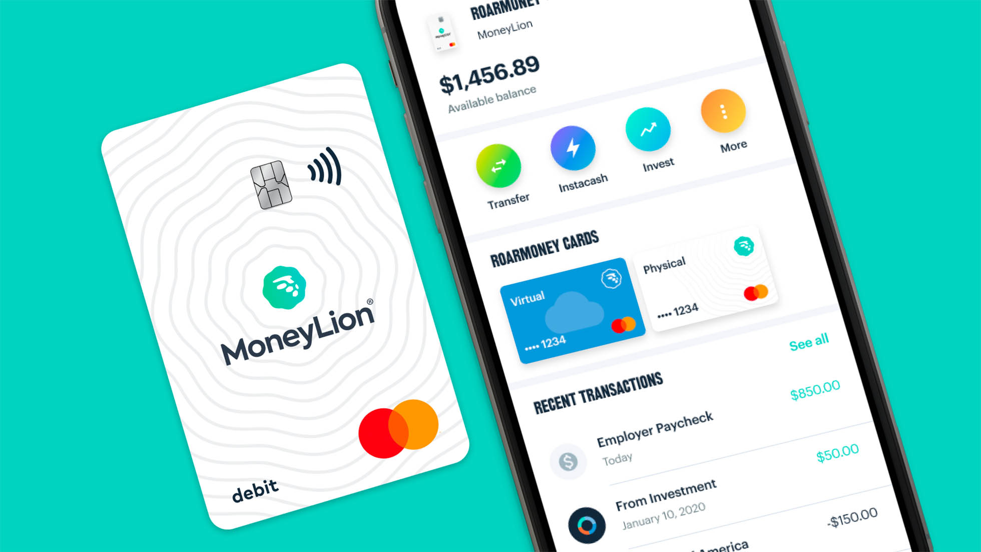
As you look over the design patterns and branding of the apps below, you will notice that each app combines a clean, muted background with colorful, dynamic foreground elements. This is a way for the app to draw the user's attention to specific elements on the screen, and encourage them to explore without feeling overwhelmed.
These apps also give their numbers more prominence, so that a user's eyes will remember where to quickly find a specific value on the screen as they return to the app, with no need to look around for it and read every label.
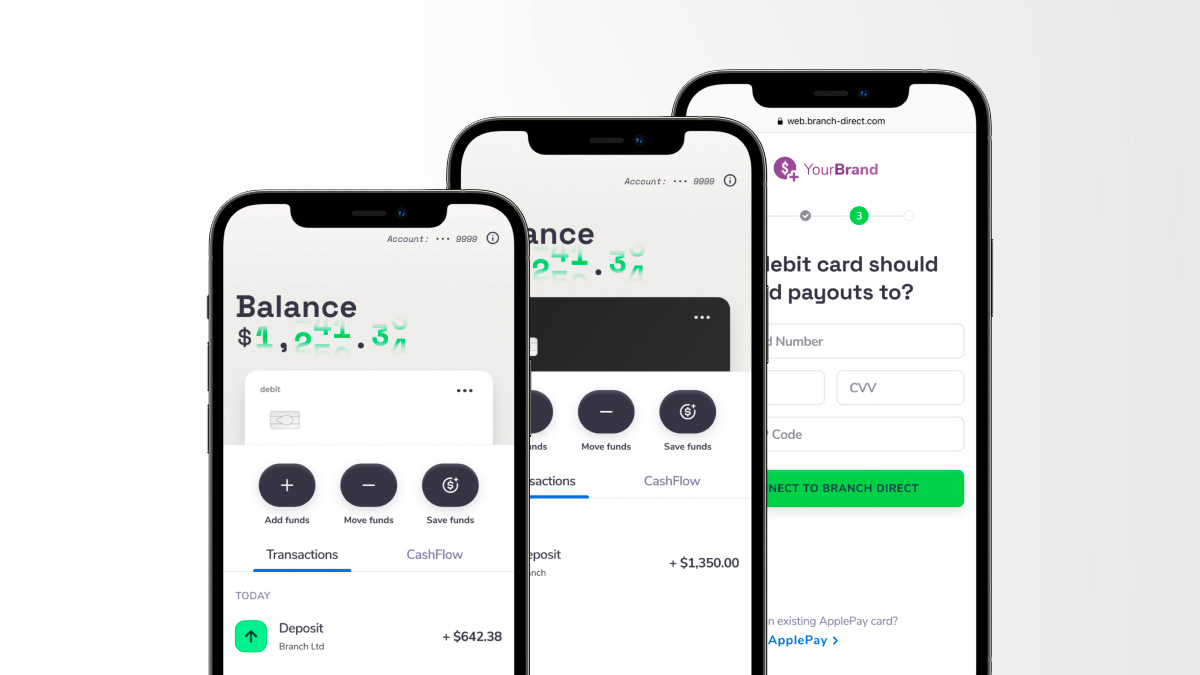
Dave
MoneyLion
Branch
The design
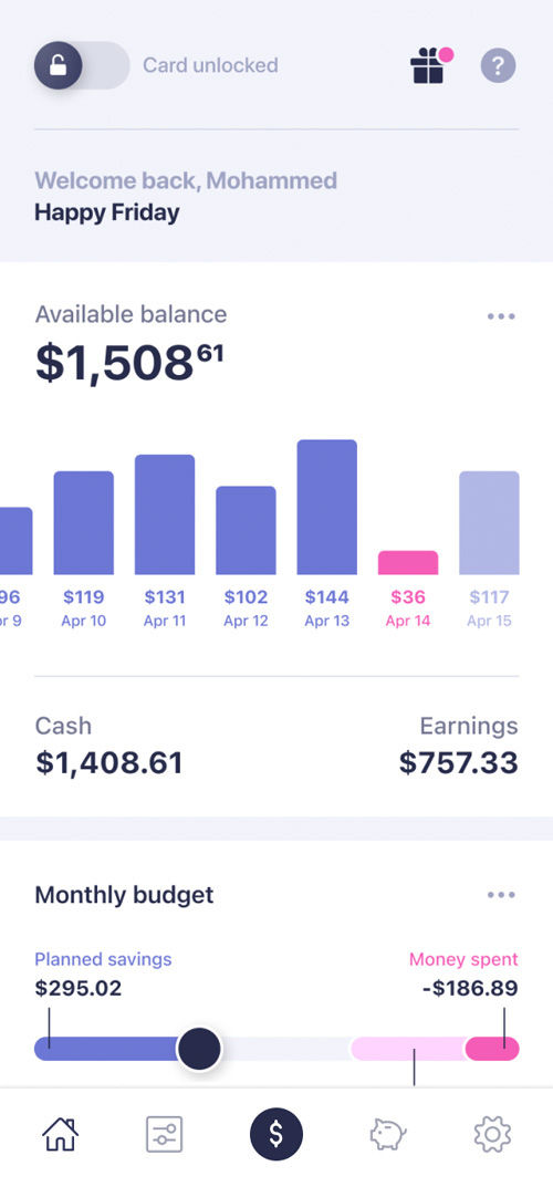
Beginning at the top of the new home screen, you can see that the first feature is a lock widget, allowing the user to lock and unlock their card from the very top of the screen. They also have a welcome message, to add a human touch.
Rather than giving the user a snapshot of their data, I've chosen to visualize a timeline of their financial status, as well as a prediction of what their status may look like tomorrow. This should help the user get a better sense of how their week is going, and to be better informed about financial decisions in the near future.
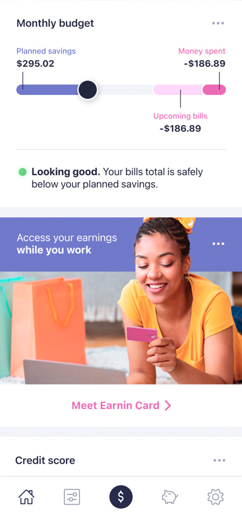
The monthly budget feature allows the user to set limits on their spending, as well as allocate money for savings, giving them yet another control feature. Directly below the budget slider is a summary of their status, which is what the user can check if they only have a moment to check the Earnin app.
For marketing material, I've chosen to introduce photography to capture the user's attention and really bring the home screen to life. This also serves as a nice contrast to the consistent tile design throughout the home screen.
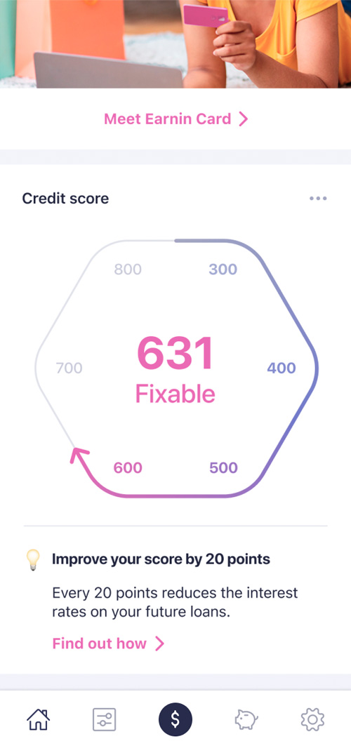
Finally, I created an entry point for the credit builder feature at the bottom, to help make the home page into a well-rounded financial journey.