Savings
by EarnIn
The challenge
Earnin is committed to improving the financial status of our users, which is why we acquired Tip Yourself in 2019 and integrated the experience into Earnin. However, we aren't seeing the adoption rates we expect from such a beneficial feature, and we find that the users struggle initially to understand what the feature is for and how to use it.

The opportunity
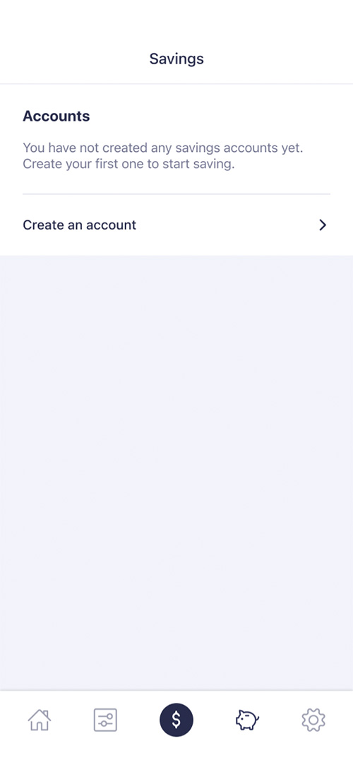
I think there's definitely room to increase adoption of this feature by making it easier to understand, and doing a better job at visualizing the user's progress. Rather than beginning the journey with a multi-screen survey, I'm imagining a sort of blank slate screen that prompts the user to begin creating their first savings account, sort of like a launchpad.
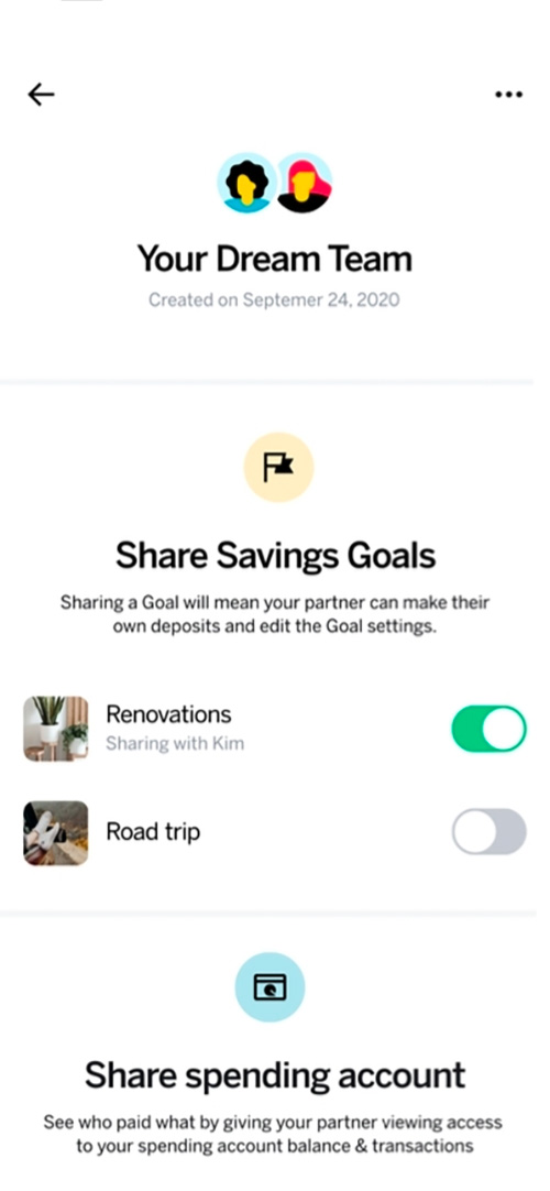
I also think that giving the user some level of customization control will make this feature feel more personal, and will motivate the user to revisit it periodically to check on progress.
Research
Competitive analysis
Although Earnin is a relatively unique product, the concept of savings accounts in an app is not unique in today's fintech space. There are plenty of standards and best practices to be found in similar products.
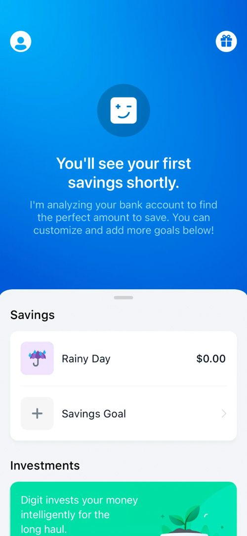
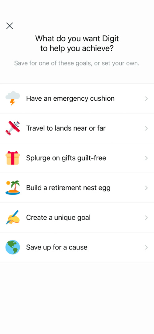
Digit Savings
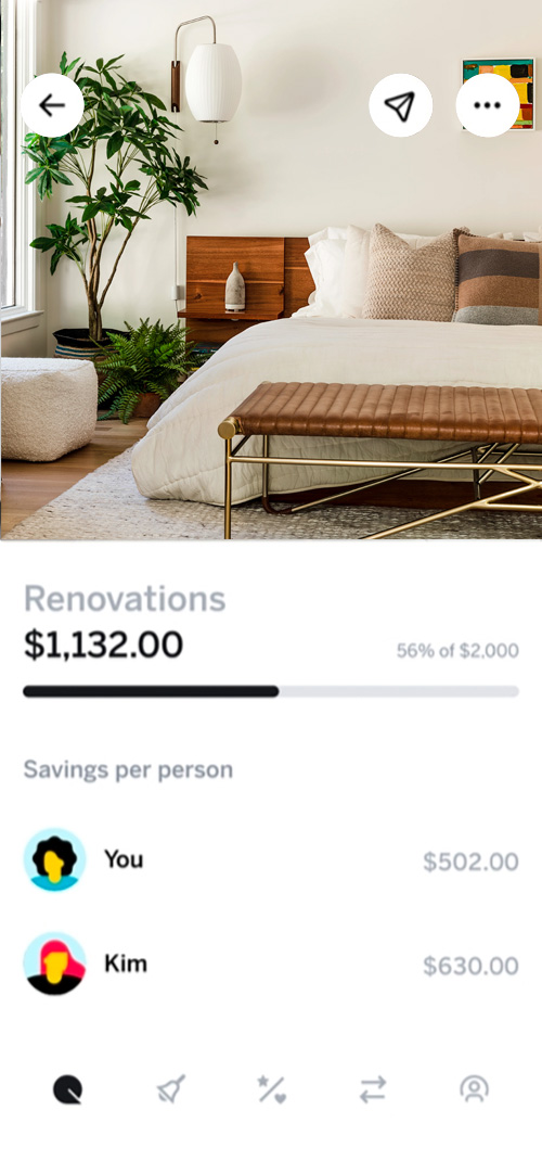
This feature does several things well from a UX standpoint. It uses eye-catching iconography to represent different savings buckets. It prompts the user for qualitative goals, which are much easier decisions than exact numbers or ranges. It also shows goal progress in a way that's simple to understand.
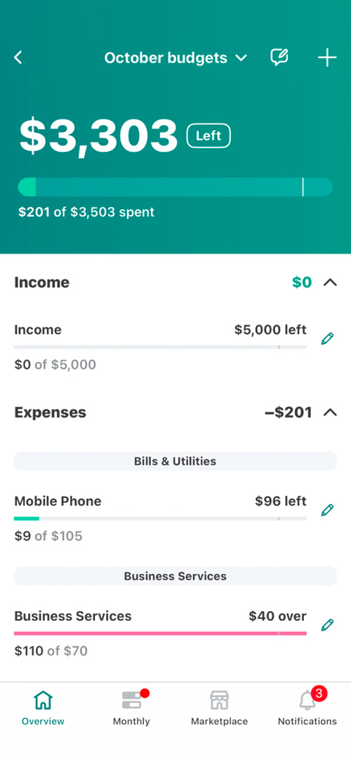
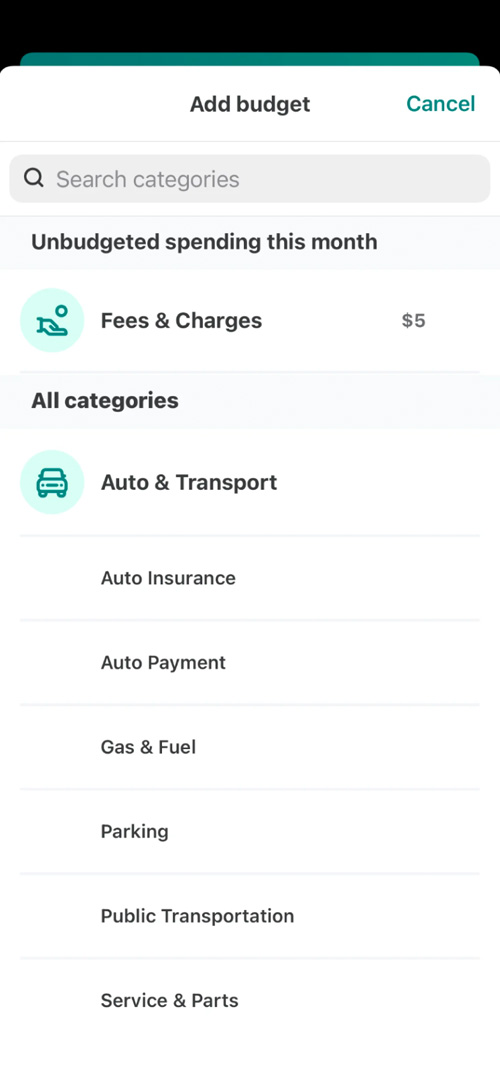
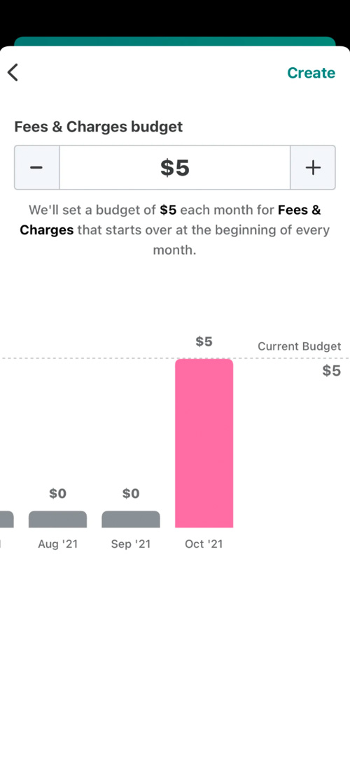
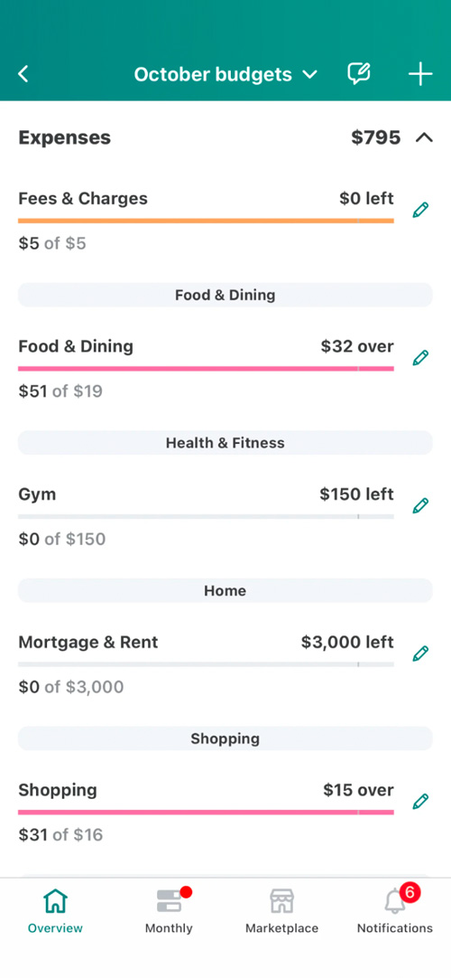
Mint Budgets
Although this UX is a more dense and potentially more intimidating than Digit's, one thing to be appreciated about Mint's design is how they use multiple colors to represent different states of the budget meters. It's also nice that they have a monthly aggregate budget, could be worth exploring.
Qapital Goals
I'm partial to black-on-white design patterns, because they tend to reserve color to communicate information. In the case of Qapital's Goals feature, the clean UI draws attention to the important data, and the photography makes the goals feel more real, personal, and attainable.
The design
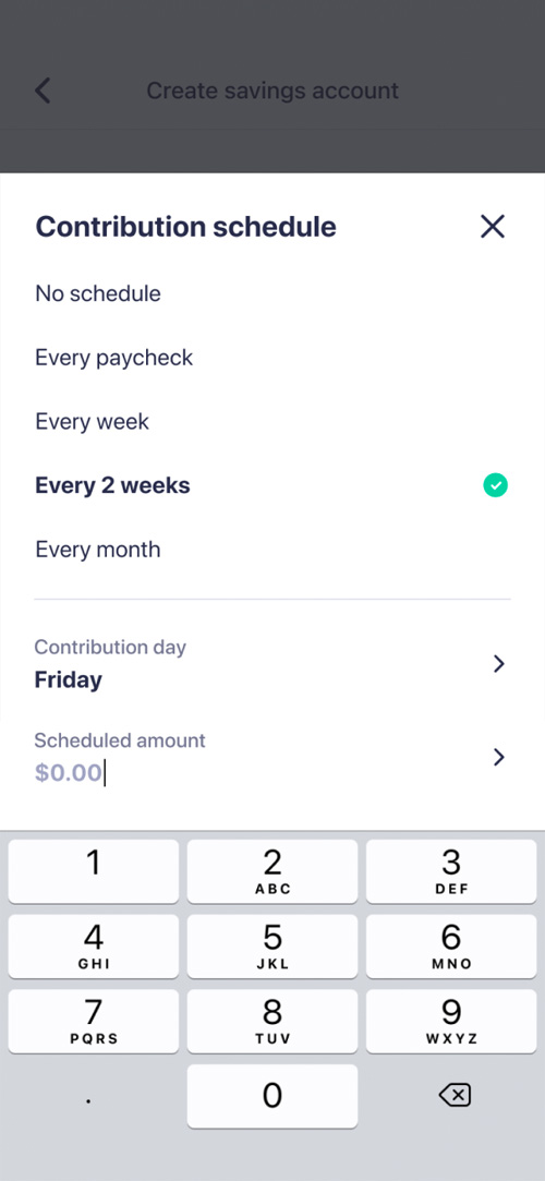
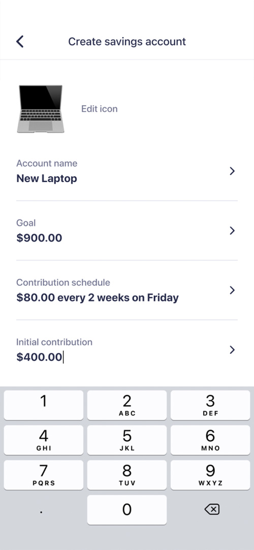
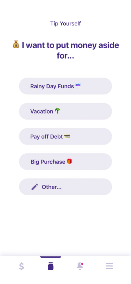
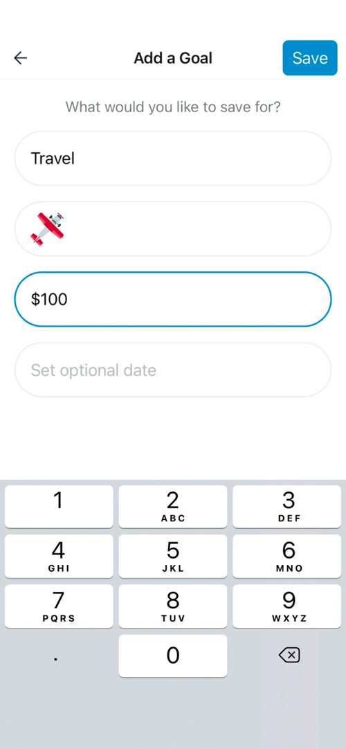
As mentioned before, I decided to designate the first screen in my journey as a launchpad for users, letting them know they can get started creating their first account.
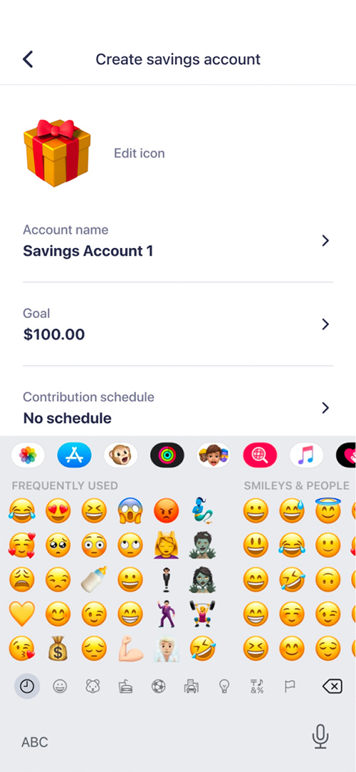
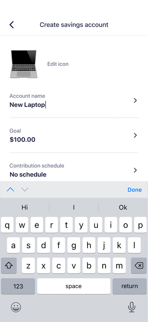
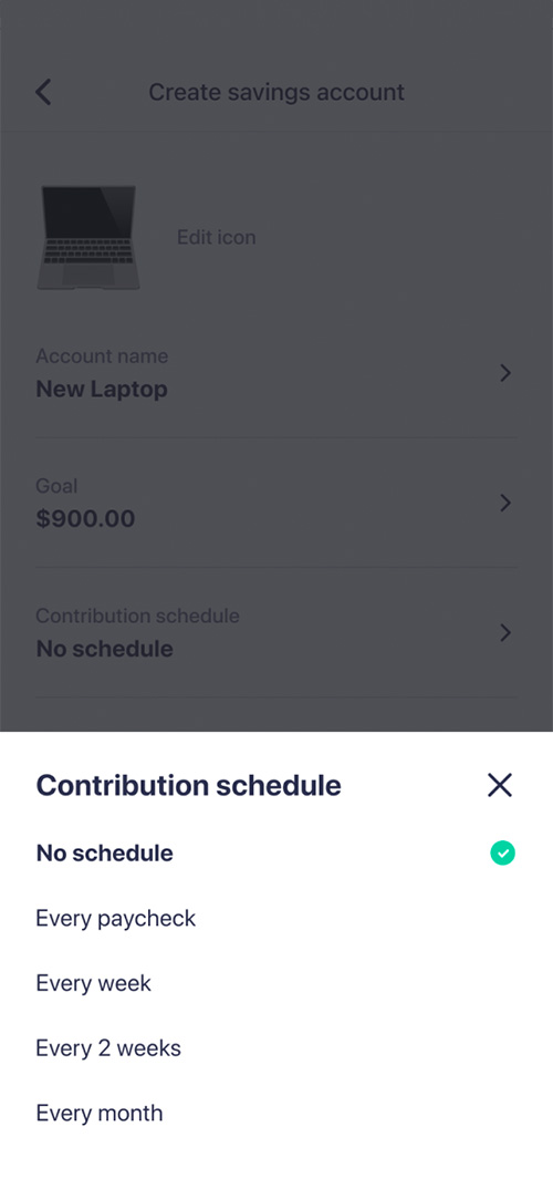
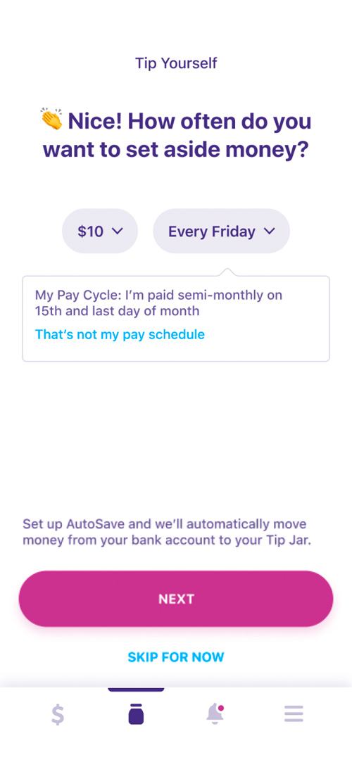
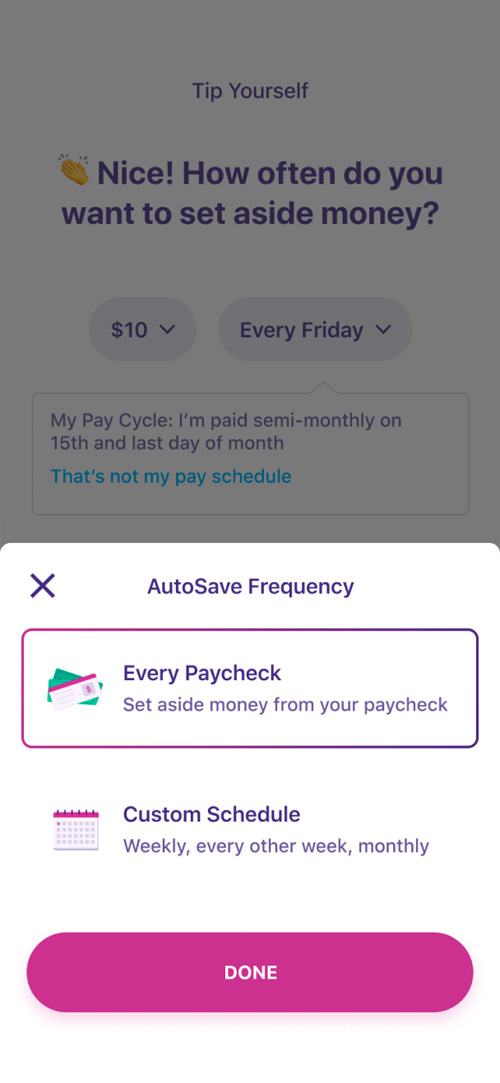
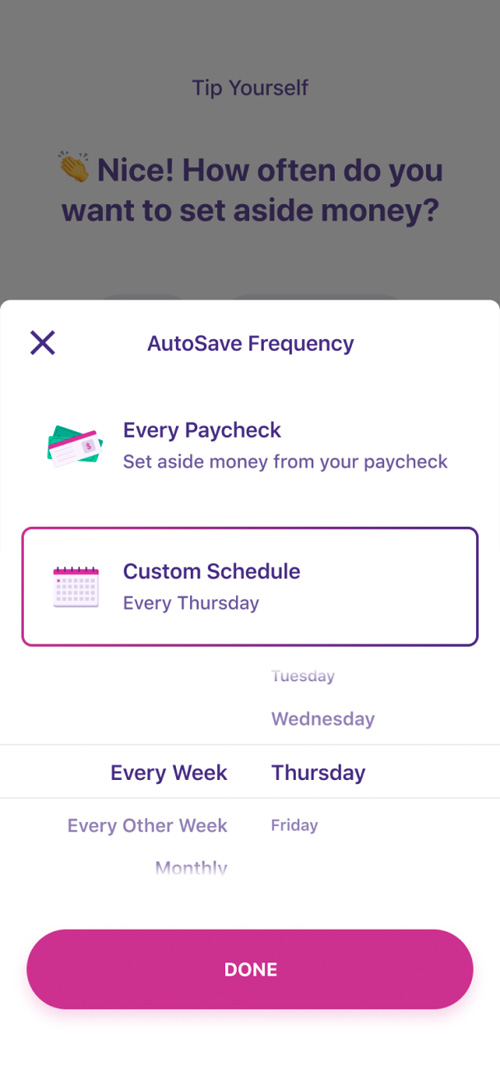
As a fun first step in the process, and to introduce customization, I've allowed the user to start by choosing an emoji to represent their account. The user then continues to fill in information until the account is ready to be created, without ever leaving the screen, instead interacting with a series of partial sheets. This fits into the vision of reducing friction, which is consistent with other features I've redesigned for the Earnin app.