Transfers
by EarnIn
The challenge
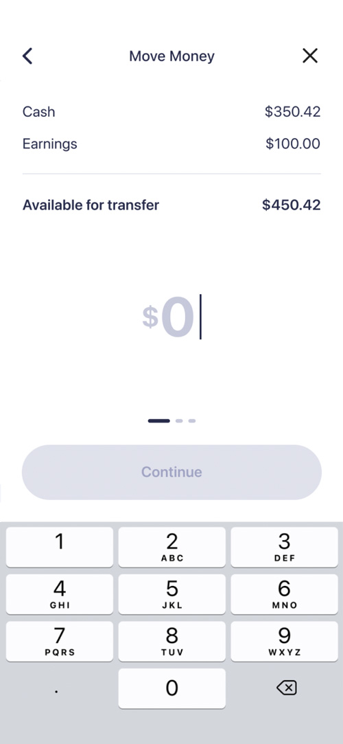
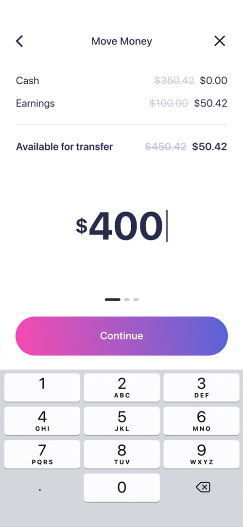
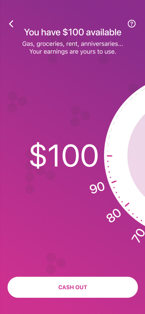
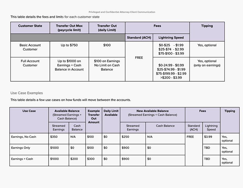
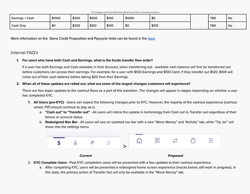
Earnin is transitioning from simply an earned wage access provider to a full-fledged neobank. In the past, transfers were capped at $100, and so our journey featured a money wheel that a user would "spin" to choose their transfer amount. Now, we need a money transfer experience that can handle amounts well over $100.
We also want a design that has the maturity and simplicity of a well-respected bank. This means scaling back the exciting colors and fun features, and designing an efficient experience that the user can repeat with minimal effort and recollection.
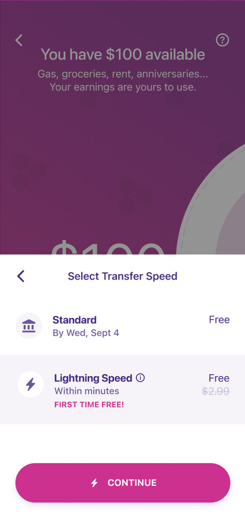
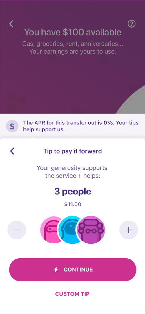
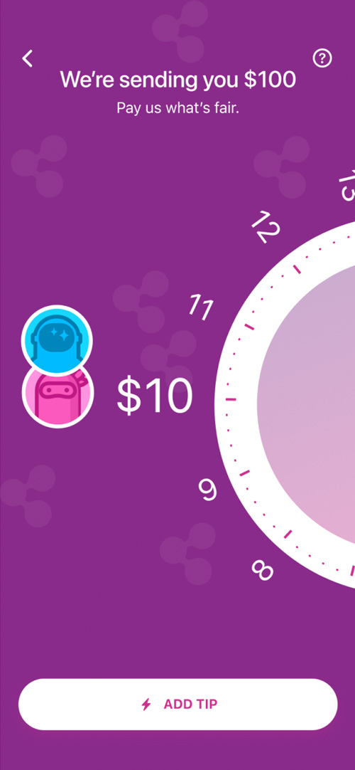
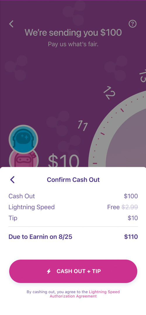
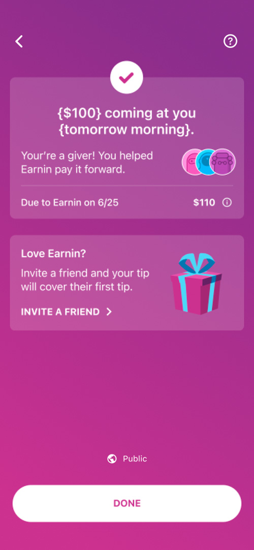
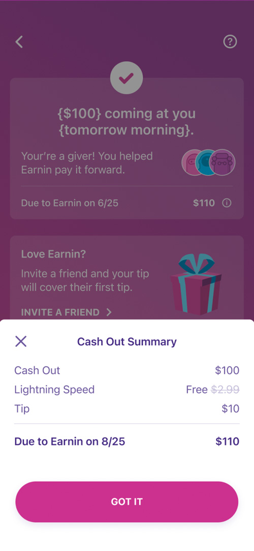
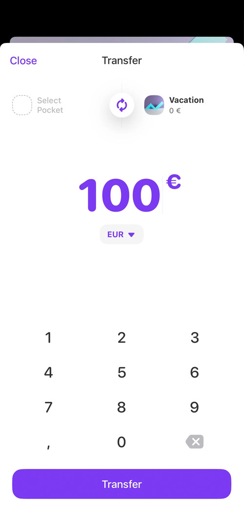
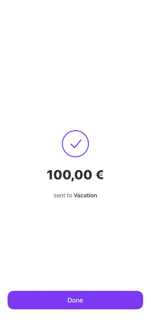
Current design

The opportunity
My vision for this design is to draw inspiration from modern money transfer apps which accomplish the journey in fewer steps than Earnin does, by manipulating a small number of screens, rather than transitioning between more of them. This will increase the fluidity of the process and make it feel shorter than it is.
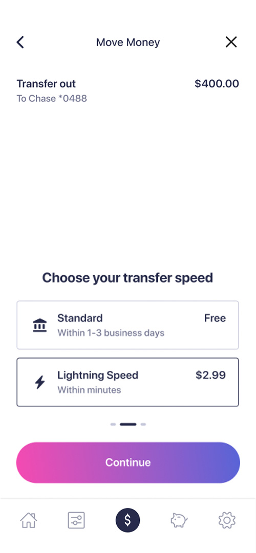
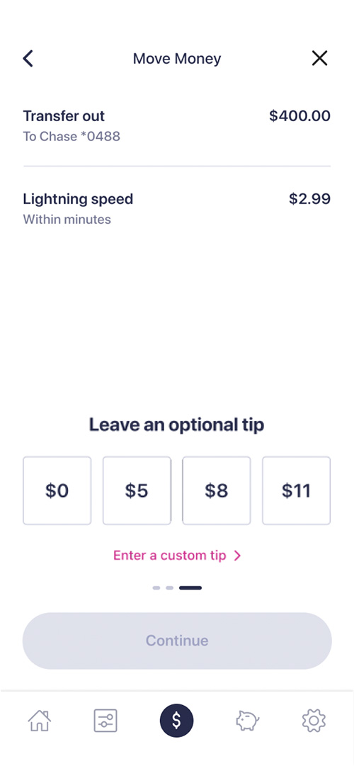
I would also like to re-balance the design elements in this journey by starting with a blank slate, then introducing the transfer amount, then the actions, and finally the remaining features.
Research
Competitive analysis
You will notice in the examples below how modern apps make use of negative space to instill a sense of calm and allow the user to focus on the intention of the journey. You may also notice that, rather than having several screen layouts, these apps essentially have one or two different layouts, and as the user progresses through the journey, different features are introduced to the existing screen.
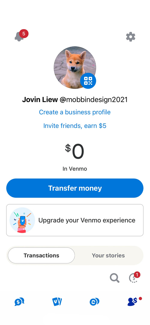
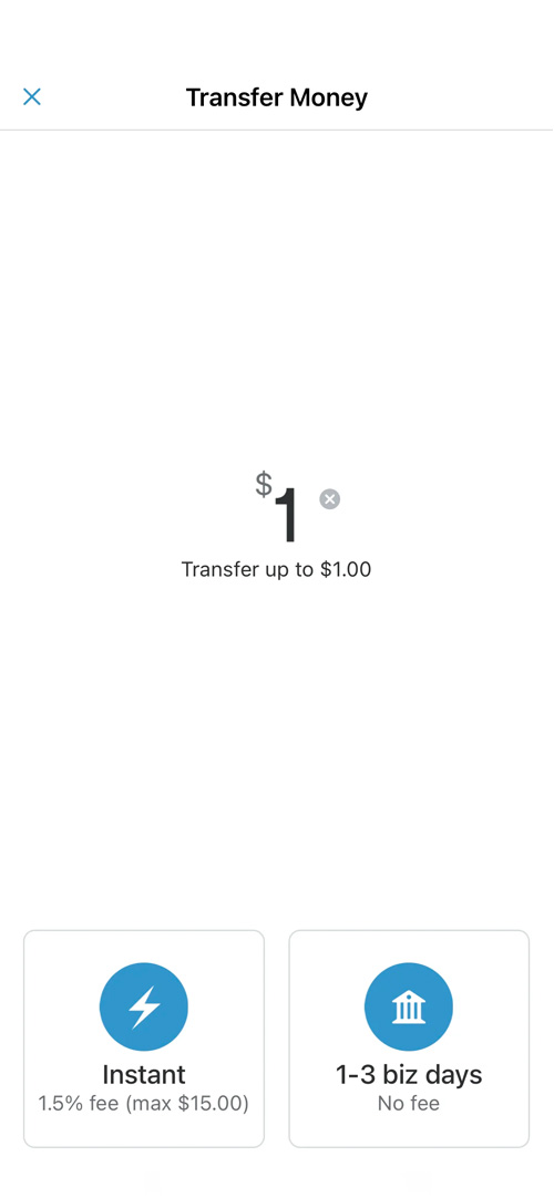
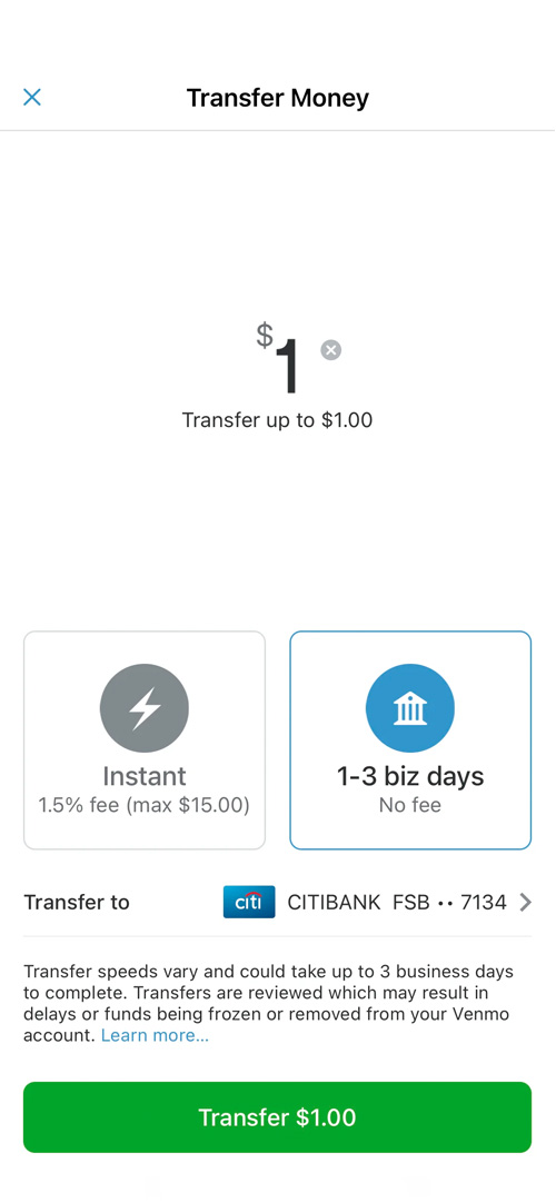
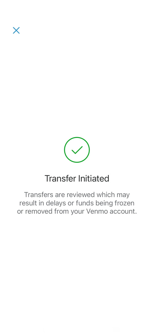
Venmo
In the case of the Venmo app, you can follow the transfer amount through the entire journey, and notice how every existing feature slides up to make room for new features as they're introduced, which is much less jarring than having to interpret a new screen for each step. I also appreciate that the calls to action are found at the bottom of the screen, where the user can easily tap them.
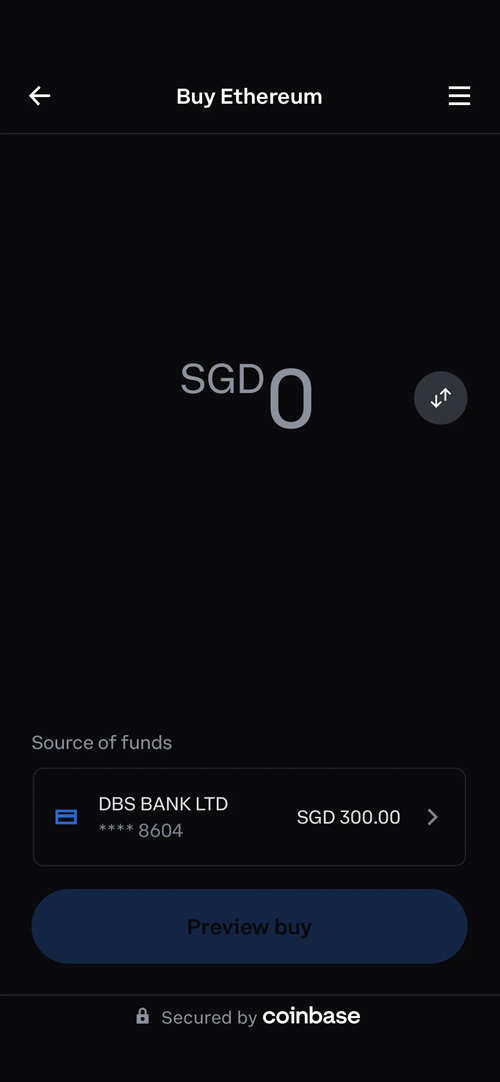
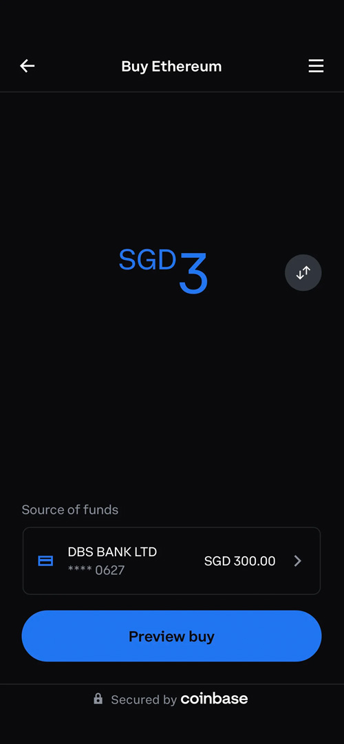
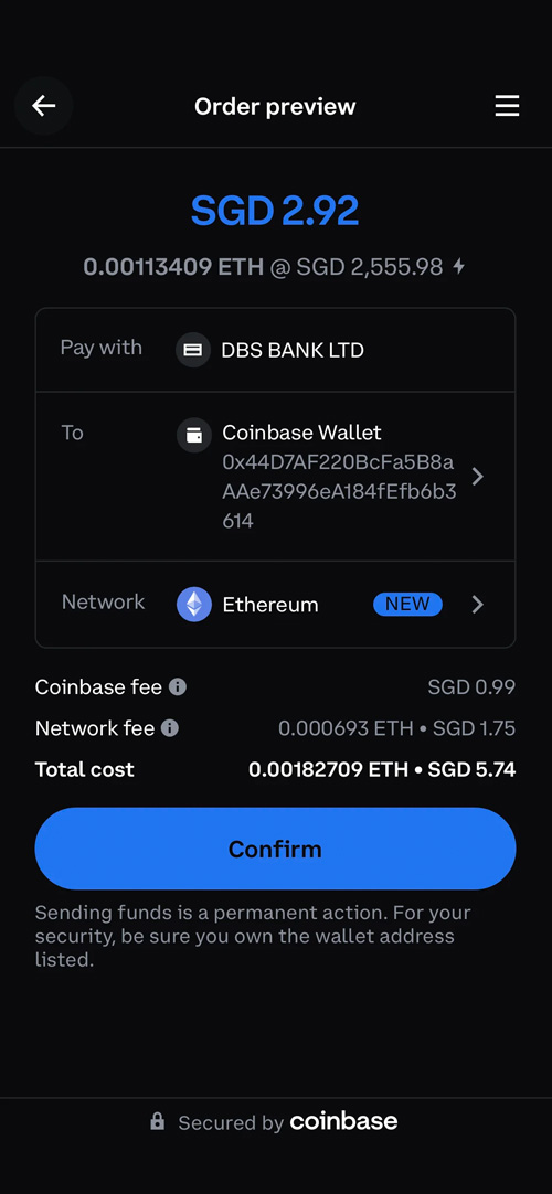
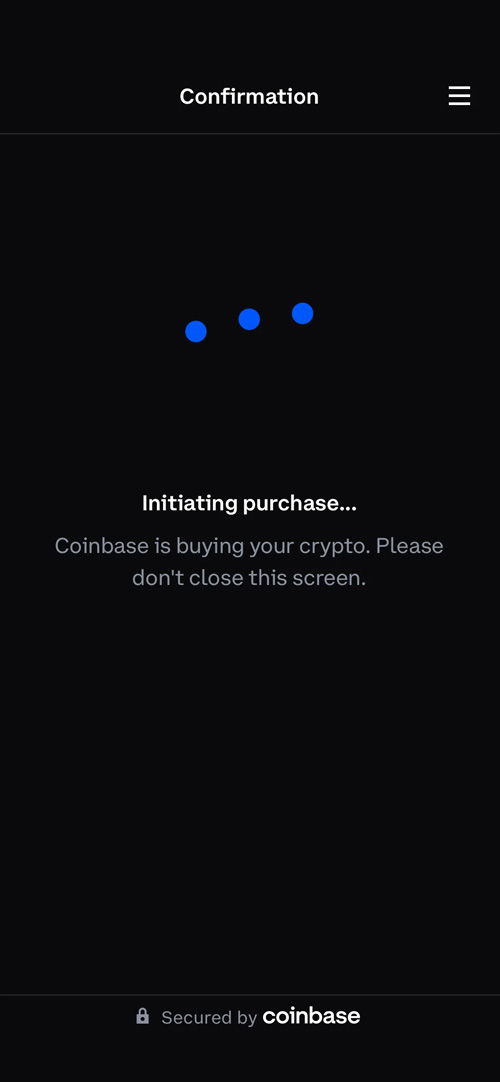
Coinbase Wallet
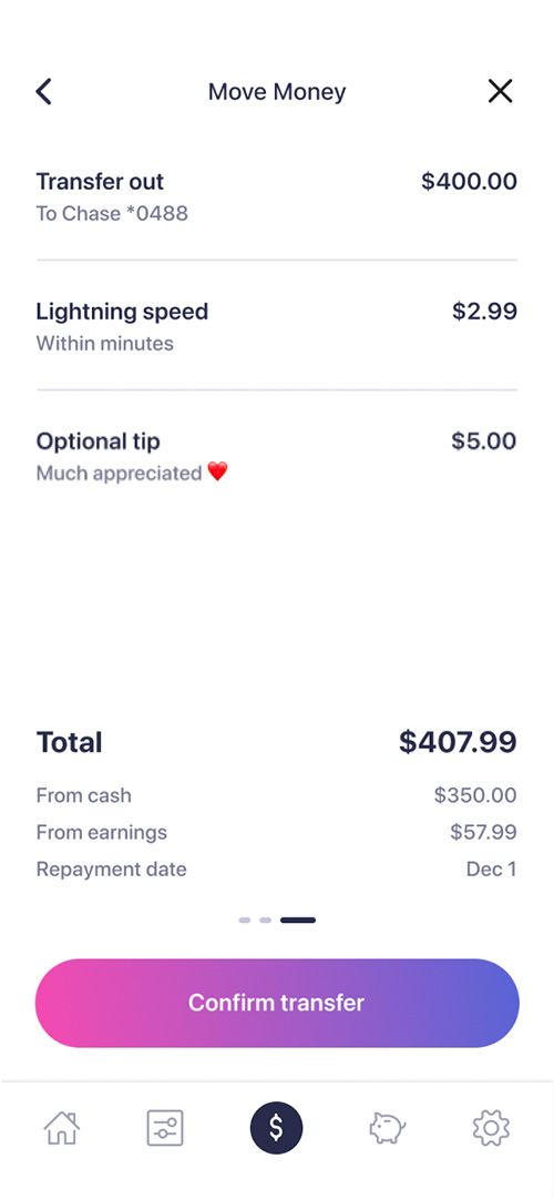
This app has a nearly identical journey to the one above, except in a dark theme. Also, unlike the Venmo app, this experience features full-width calls to action, which might fit better for Earnin in some cases. Finally, the confirmation screen with summary info would be useful for Earnin customers.
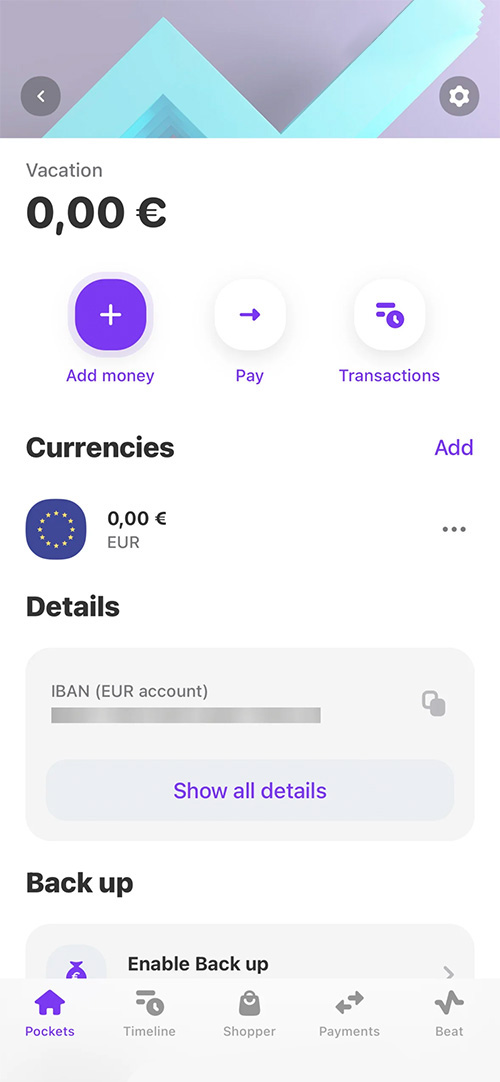
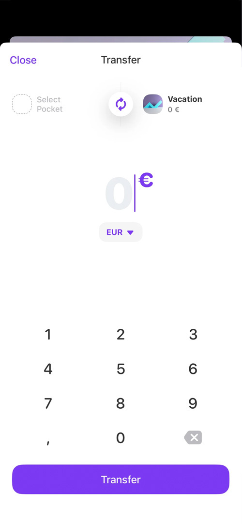
Vivid
Again, we see negative space with a large transfer amount in the center, as in the other two examples. One thing that distinguishe the Vivid app is that they make use of the top of the screen, where they place informative elements.
Design proposal
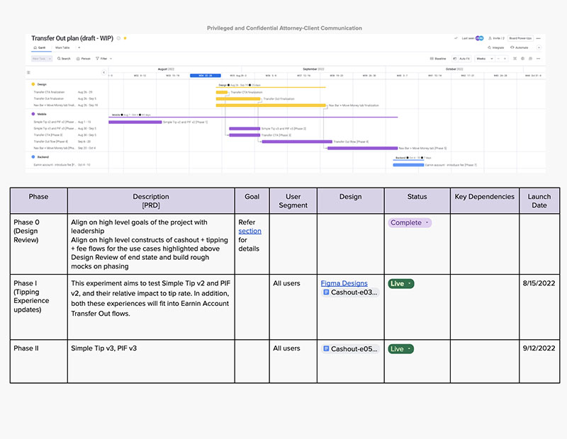
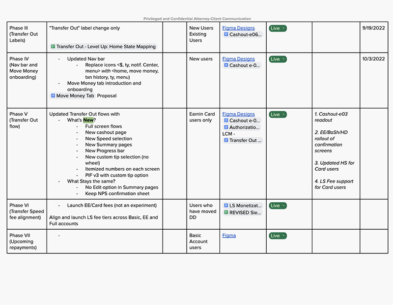
Needless to say, redesigning the user experience for our primary revenue stream involves many stakeholders and weeks of research and testing. To keep everyone on the same page, one of my responsibilities was to prepare a design proposal report. This served to guide the conversation between members of our cross-functional team. The report covered important subjects such as:
- Project management: Coordinating schedules and existing priorities to ensure we have the runway to deliver this project on time.
- Engineering: Making sure screens and features are built on a strict schedule, and in an order that prevents backtracking and wasted effort.
- Design: Organizing a network of Figma files and resources that can be referenced and advanced by other designers on the project.
- Legal: Keeping tabs on rules and regulations, as well as open questions and concerns, that must be complied with before launching the new feature.
- Copywriting: Highlighting areas of the project that will require several versions of copy which can be tested via qualitative and quantitative analysis with our customers.
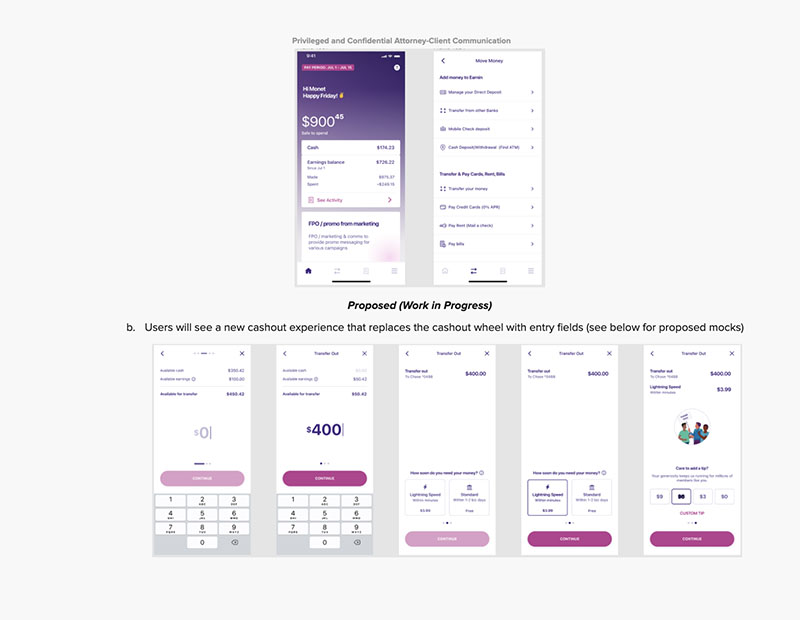
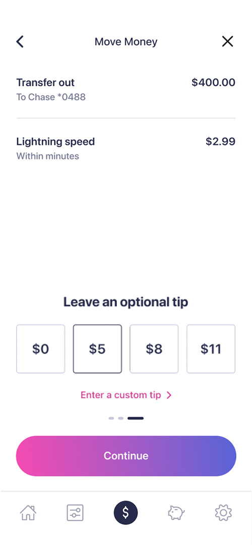
The design
With so many examples following a tried and true formula for handling this type of journey, it felt natural not to get too creative with this project, and instead follow the best practices established by some of the most commonly used apps in the space. This allows us to present a minimalist design, while also leveraging the familiarity that our users have with other money transfer apps.