Little Brother
The challenge
According to a Gallup survey, only 17% of Americans are "highly informed" about the U.S. Congress, and only 20% follow news about national politics "very closely." Some of this is no doubt attributable to our polarized political climate, but there is also a complexity to our government that can discourage learning more about it.
Nevertheless, an informed electorate is necessary for a healthy democracy, whereas a population of uninformed voters can open the door for corrupt politicians and opportunistic corporate lobbyists.
The opportunity
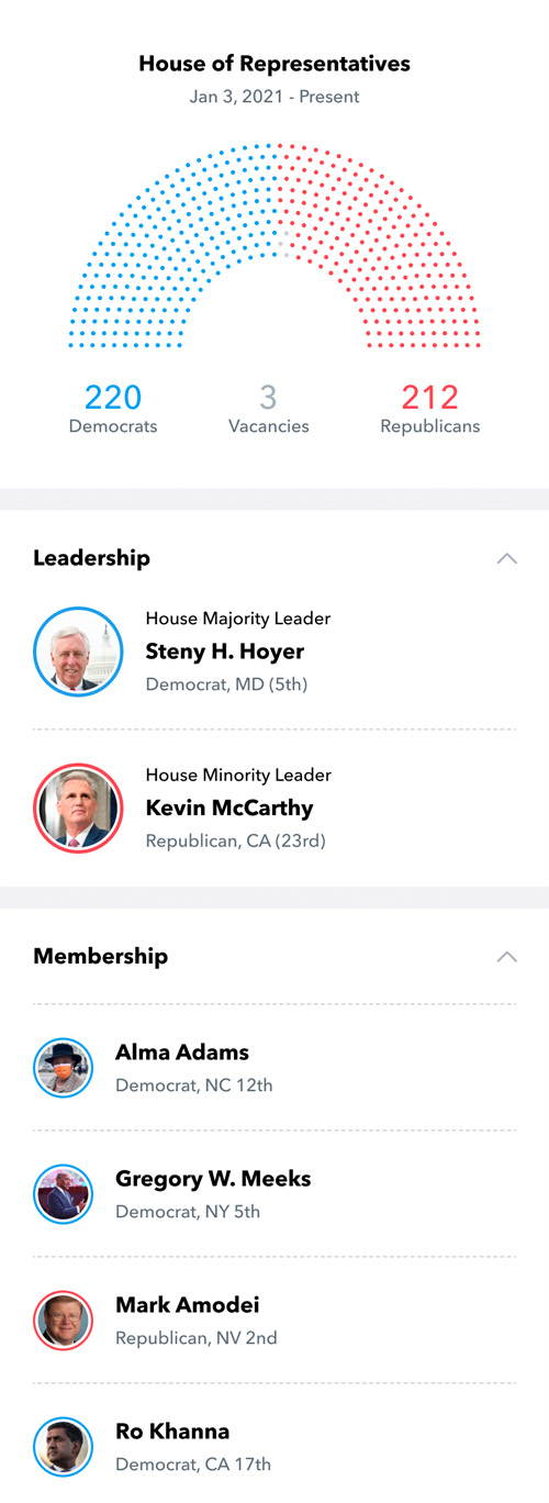
The ultimate goal of this project is to create an app that allows each user to track the bills and legislators that matter to them, as well as provide intuitive tools that allow the user to learn about how different parts of Congress function.
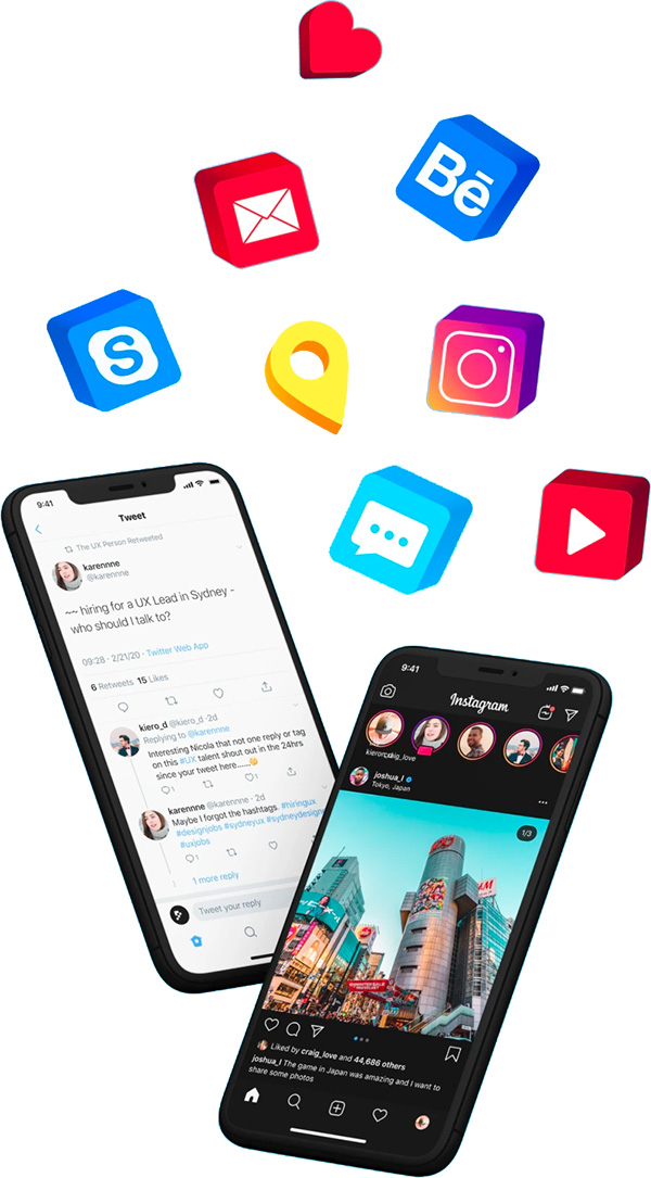
That's easier said than done. However, I believe I have a huge advantage as a designer: social media. The typical social media user has amassed a wealth of UX knowledge and experience over the past two decades, and I believe these tools can be used to simplify highly complex concepts.
Rather than trying to design an experience around the logic of Congress, I instead chose to fit the logic into a social-media-style experience, in order to leverage the familiar design elements with which users have been engaging for years.
Research
Competitive analysis
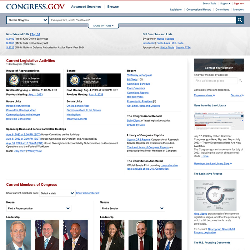
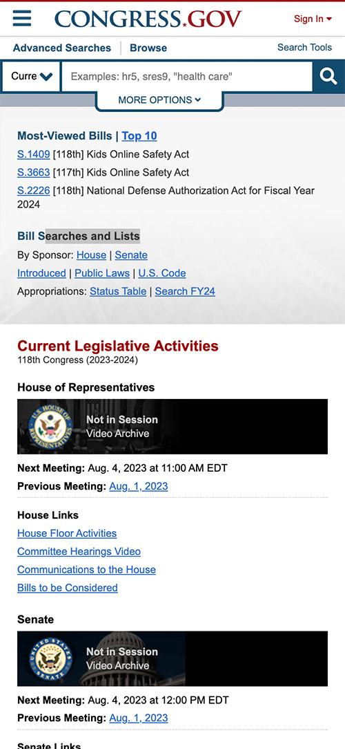
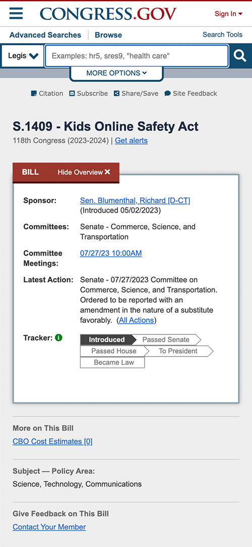
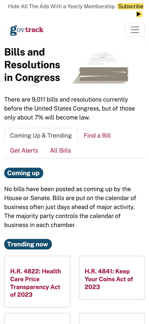
"Competition" is a generous descriptor for apps in this space. There are only two real players in the game, one of them being the U.S. government. Compared to a typical social media site, the audience for a Congressional oversight app skews much older, more well-informed, and less receptive to online marketing.
Without the potential ad revenue, there's not much UX talent at work here. The apps feature early 2000's design patterns reminiscent of newspapers, and while the experience is responsive, it's not optimized for mobile viewing.
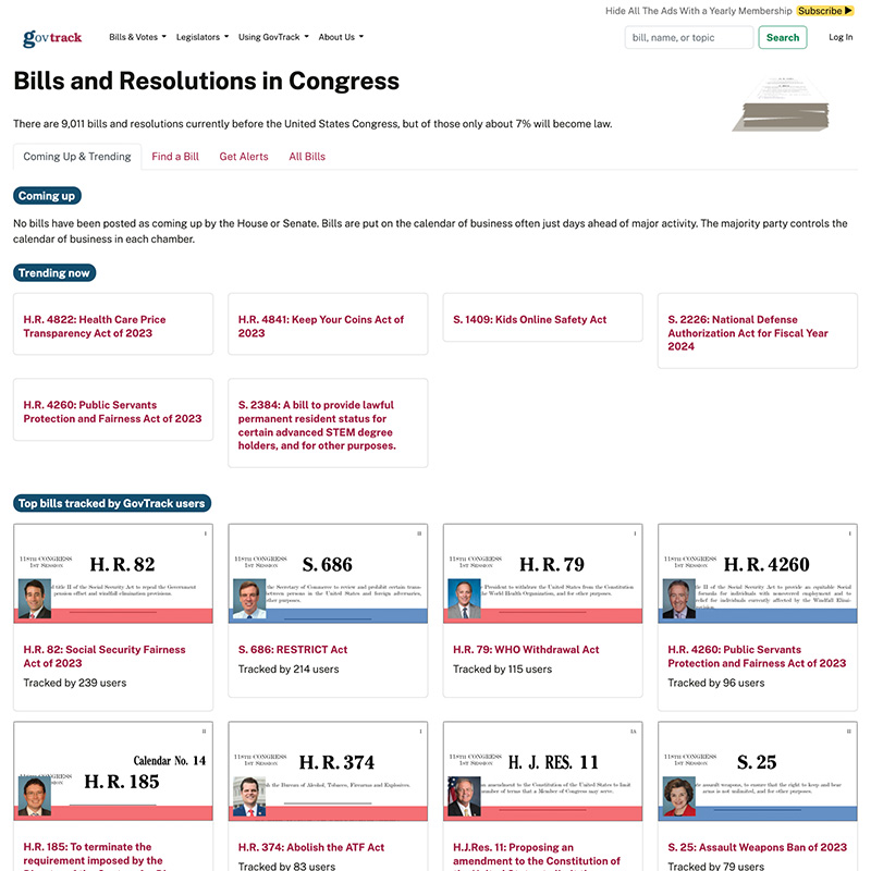
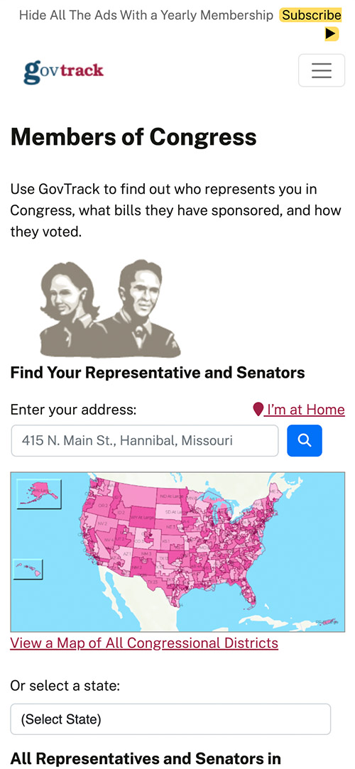
Congress.gov
GovTrack.us
User interviews
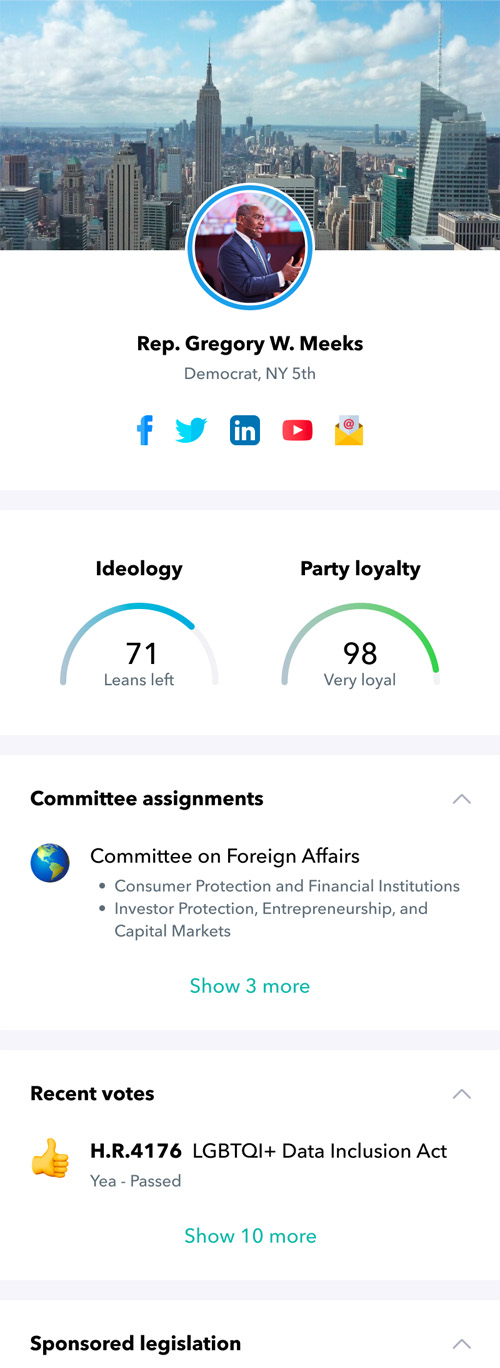
My approach for generating useful responses is to treat bills and legislators as articles and authors. The hypothesis is that I can use the same tools that drive engagement for news articles to make legislation more appealing. This will allow me to not only add a viral element to the design, but will make it much easier to find interviewees, since many more people have experience reading news articles than reading legislation.
Here are a few of the interview questions I asked, answered on a scale from strongly agree to strongly disagree:
- I’m more likely to read the title of an article if it has a cover photo.
- I’m more likely to read an article if it has a short title.
- I’m more likely to read an article if I’m familiar with the topic.
- I’m more likely to read an article if it covers a topic that was recently addressed in the news.
- I’m more likely to read an article if the topic makes me feel concerned.
- I’m more likely to read an article if the author includes research.
- I’m more likely to read an article if the author includes their opinions.
- I’m more likely to explore the author of an article if the author seems to share my views.
- I prefer to read a few long articles than to read many short ones.
- When an author mentions a topic in their article that I’m not familiar with, I will research that topic.
The design
Wireframes
I love to begin every design project with drawing, as I feel this connects me emotionally to the concept. Also, without the convenience of copy, paste, and undo, I'm forced to make decisions deliberately, and limit the temptation to get too granular. Once the design gains momentum and patterns begin to reveal themselves, I get to work on a design system.
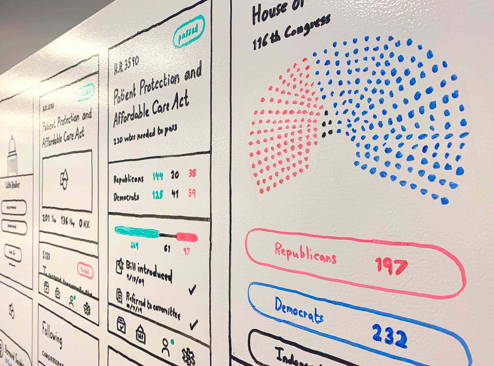
Design system
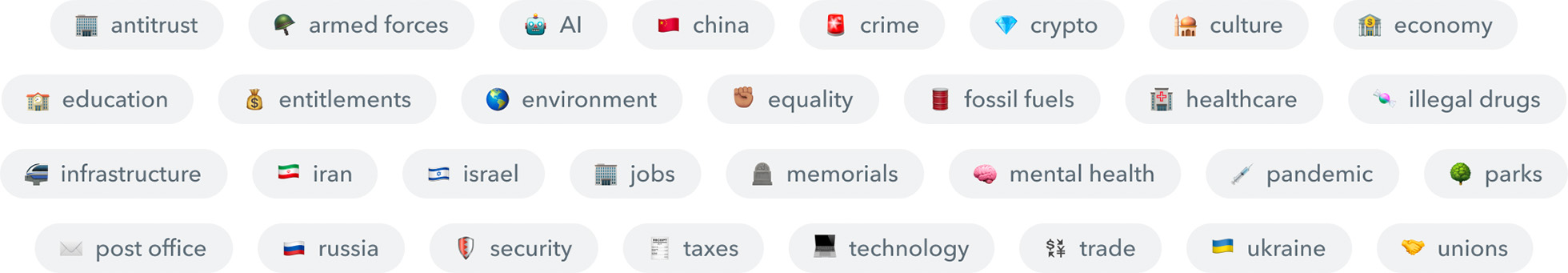
Since I'm working with content that is dry, dense, and complicated, I have two primary objectives as a designer. First, I want to use aesthetic design very gently, taking care not to distract my reader. For that reason, I went with a black on white pattern, I designed outline icons, and I chose neutral colors that convey information.
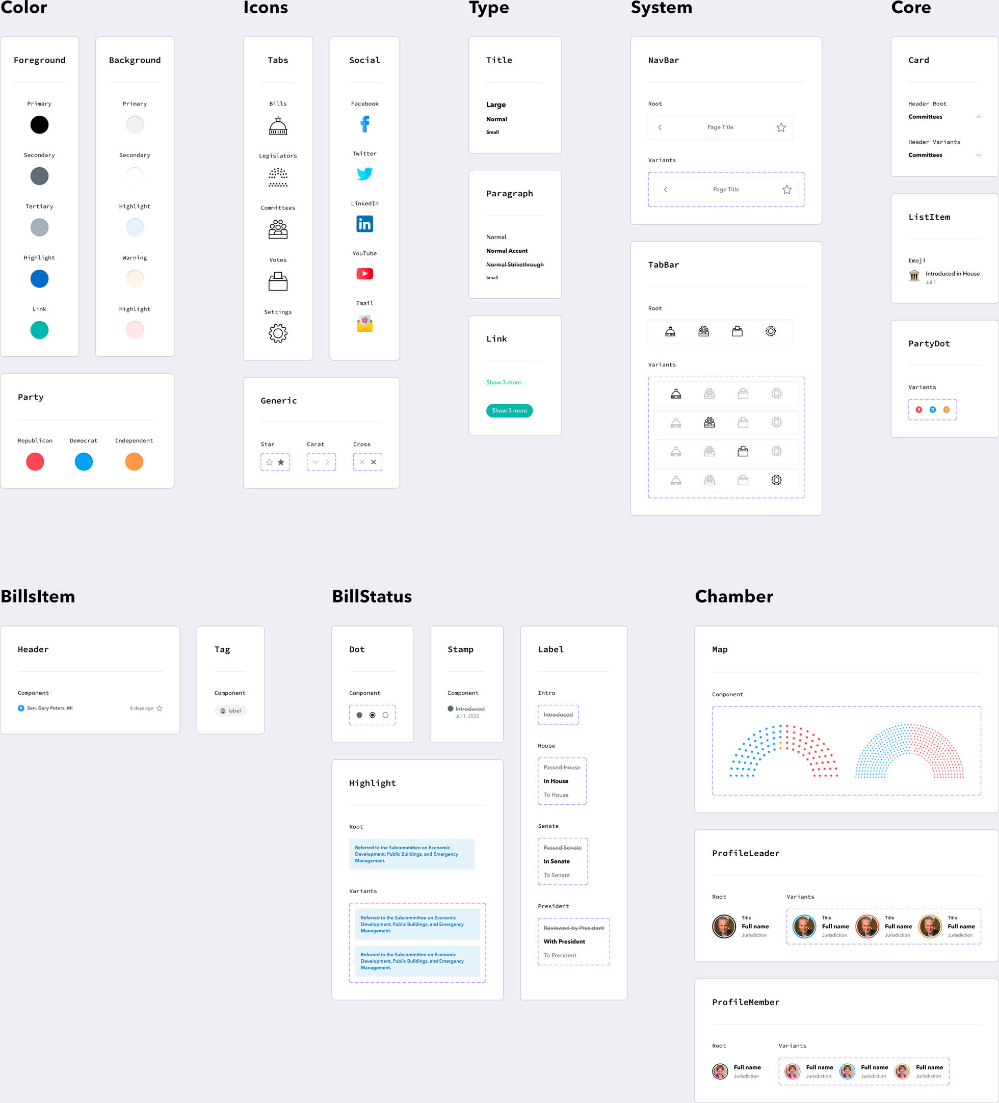
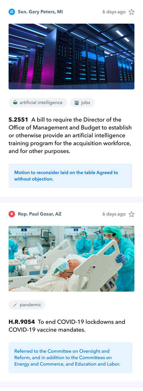
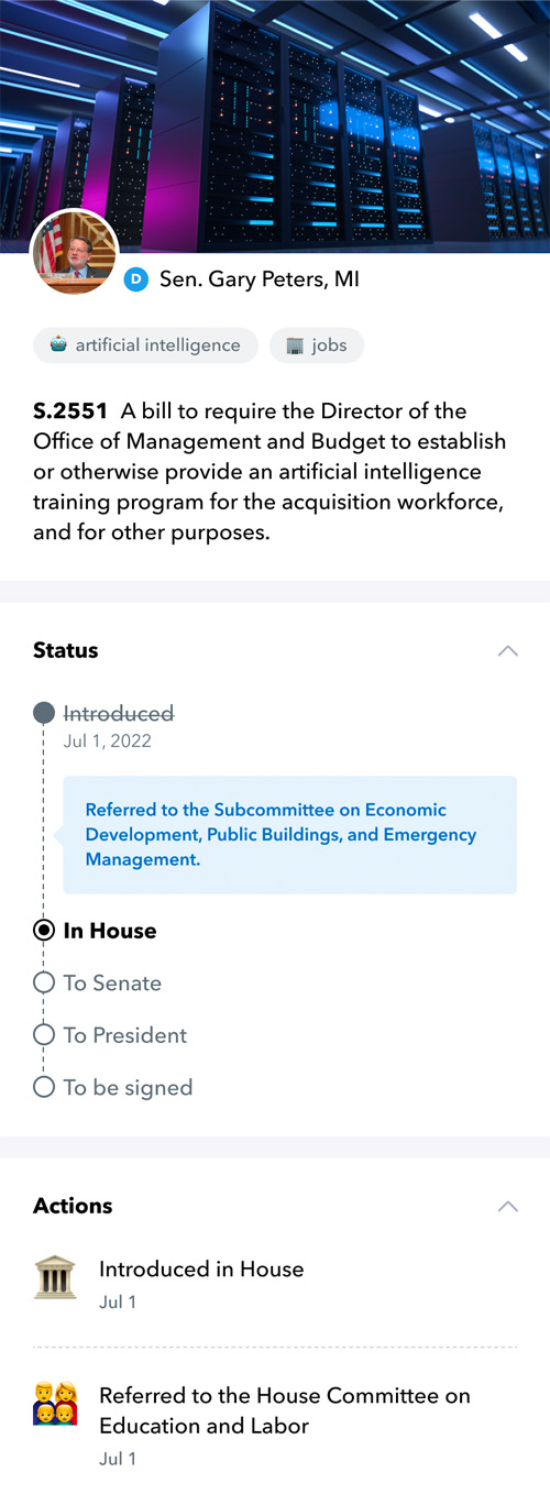
My second objective is to leverage photography and iconography to enrich the experience communicate with my readers using more than just written language. To do this, I wrote a simple algorithm that scans a bill for keywords I've chosen, and tags that bill with matches.
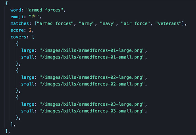
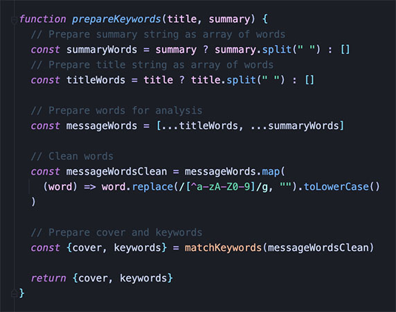
Once a bill is tagged with one or more keywords, I can assign a set of cover photos to that bill, and choose a photo at random. The chosen photo can now serve as a unique identifier for the bill that the reader can recognize, without having to read anything.
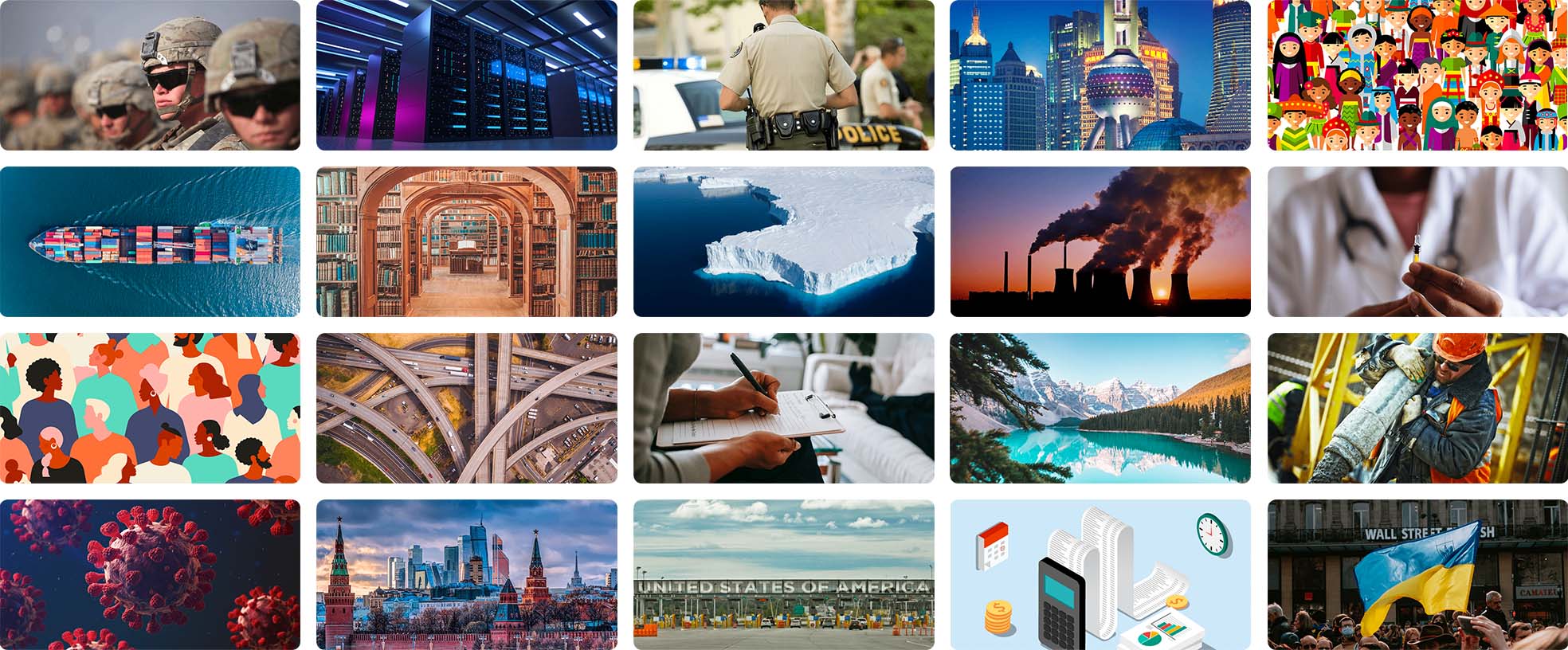
While photos can be an effective way to identify a record, tags can serve as a powerful tool for grouping them together. A reader can take a quick look at a bill's tags to determine if the topic interests them.
The result
By combining minimalist design, informative aesthetics, and attractive imagery, I'm able to construct an experience that takes dense, verbose, language-heavy content and transforms it into something that is dynamic and eye-catching. If legislation is like a newspaper, the goal of this experience is to serve as a news channel.
The project can be viewed here on a mobile browser. It's still in progress, but is connected to live data from Congress.